Executive Summary
I led the creation of Schedulicity’s first design system, building a token-based foundation, scalable components, and a governance model that reduced visual drift and increased delivery speed. This work brought consistency across platforms, improved accessibility, and supported engineering during a major migration to a single codebase. Even before full adoption, the system delivered measurable improvements in handoff, QA accuracy, and user experience.
Outcomes at a Glance
- Built a 1:1 design-to-code token system that reduced rework and improved delivery speed
- Standardized specs and handoff practices, cutting QA churn and improving implementation accuracy
- Introduced governance processes that safeguarded against visual drift during technical migrations
- Developed semantic color tokens that improved accessibility and ensured WCAG compliance
- Established a 4px spacing system and aligned button components across Figma and code—removing an unused size and fixing discrepancies
- Ensured consistency across Schedulicity core and Ionic components when migrating to a single codebase
- Built a foundation for future automation, mobile expansion, and shared ownership
The Problem
Before this initiative, Schedulicity had no centralized design system. Design files were fragmented, components were inconsistently built, and there was no shared language between design and development. Teams relied on ad hoc styles and duplicated patterns, which created friction, slowed implementation, and increased the risk of UI drift.
At the same time, engineering was focused on a migration to Angular and later to a single shared codebase. Without a system in place, the risk of rework and inconsistencies was high, especially across platforms.
My Role and Team
As Senior UI Designer, I initiated and led the strategy, execution, and rollout of the design system. I collaborated with:
- Front-end web developers
- iOS and Android engineers
- A software architect
- UX Researcher
- Feature designers
- The Head of UX (acting as Product Owner)
I drove the UI audit, roadmap, and system foundations. I standardized tokens, built and documented components, and made accessibility a priority from the start. UX Research contributed both quantitative and qualitative insights to guide decisions around component structure and interaction patterns. This was a collaborative, iterative effort shaped by cross-team feedback and validation.
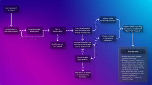
Before: A fragmented design landscape with inconsistent components and visual drift
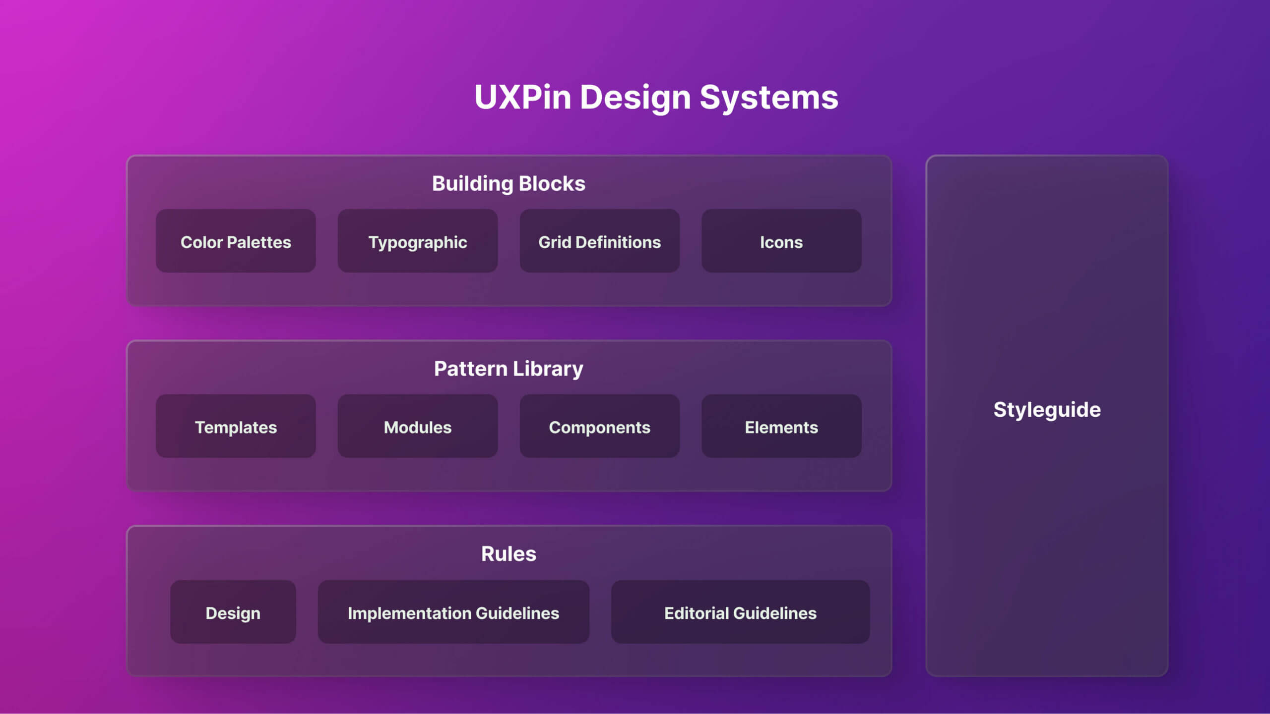
Organizing our early audit in UXPin helped visualize structure and plan rollout before fully transitioning to Figma and Zeroheight
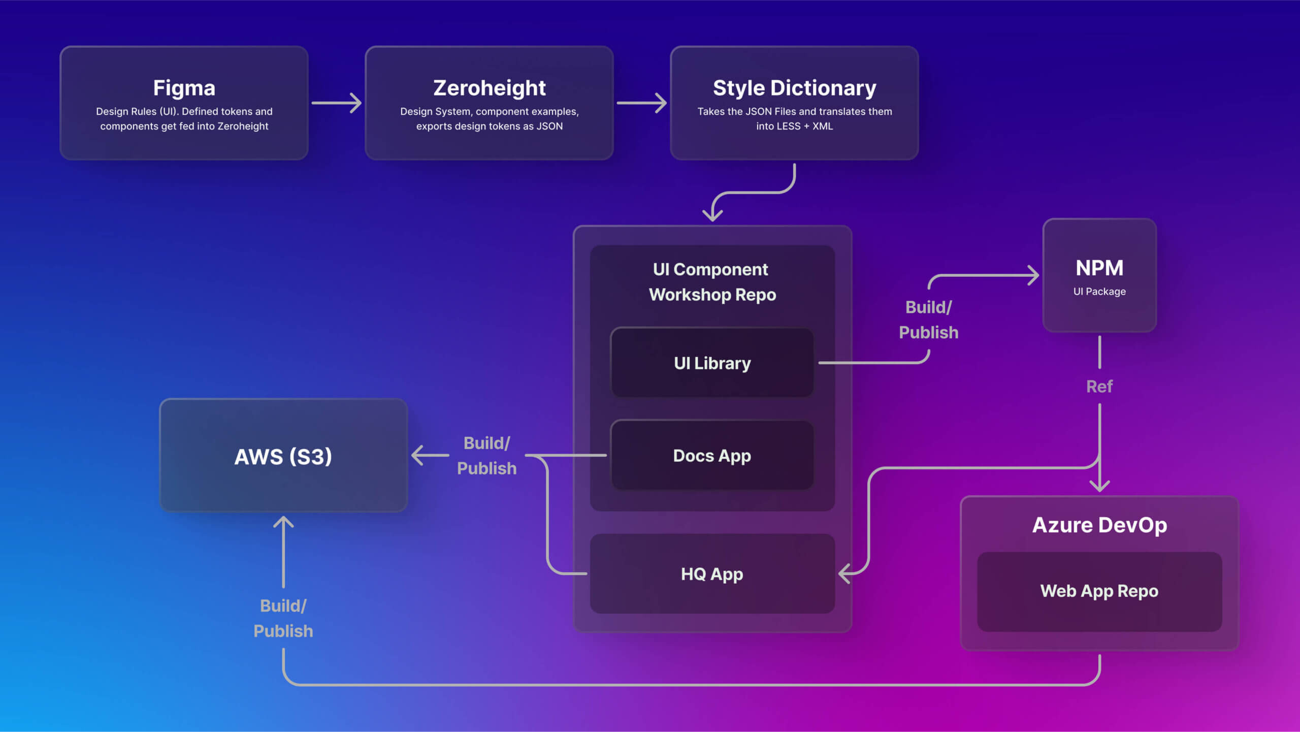
Design tokens flow from Figma to code using Style Dictionary
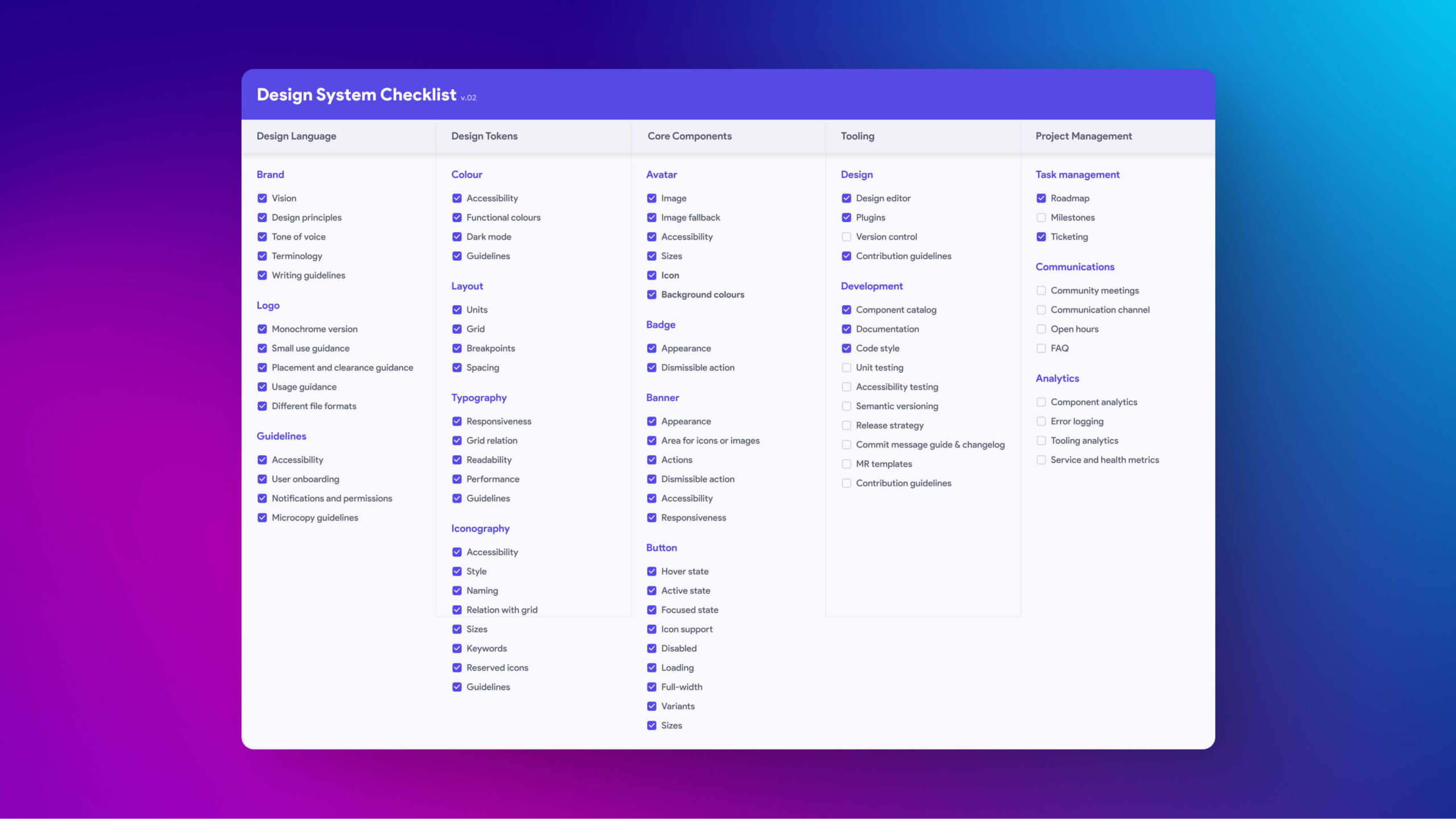
System checklist used for design reviews and QA
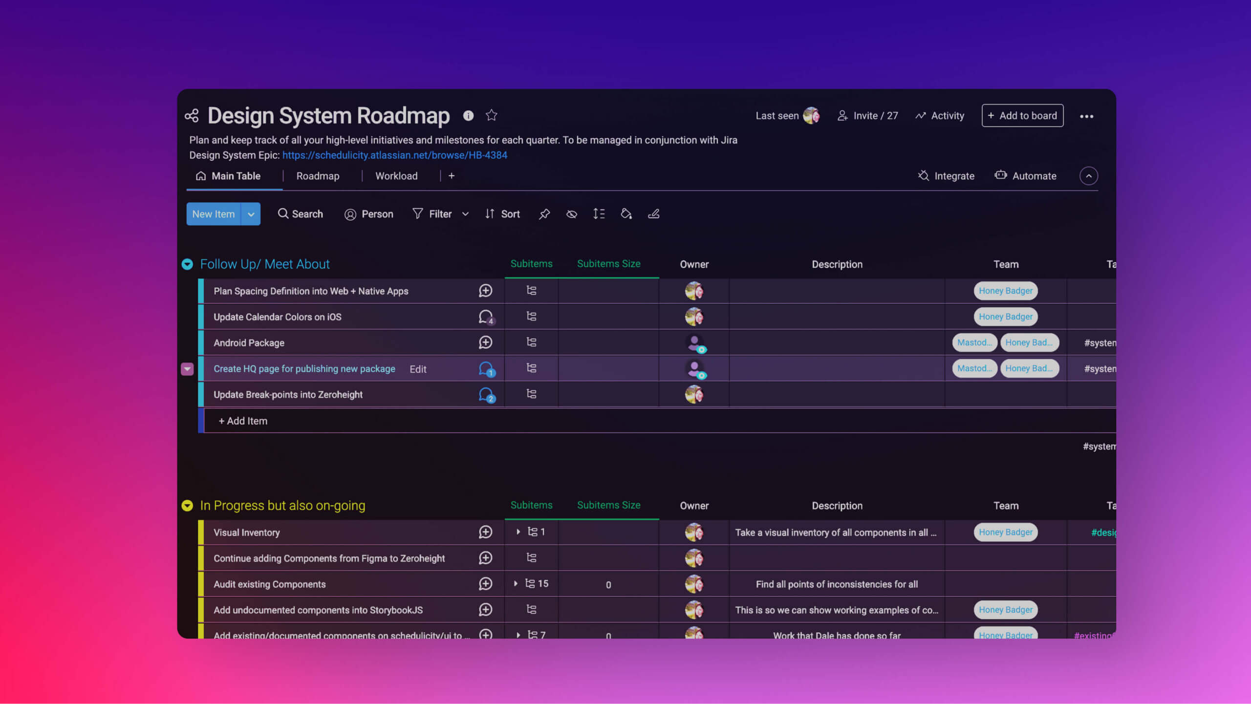
Roadmap outlining the phased implementation strategy for the design system
Process and Execution
Discovery and Planning
- Audited the UI across platforms to identify inconsistencies and redundancies
- Interviewed designers and engineers to uncover pain points and workflow gaps
- Defined MVP goals and phased rollout strategy
- Secured buy-in through demos, documentation, and examples of saved time
System Foundations
I started with base-level tokens and created semantic tokens for structure and scale:
- Color: base palette mapped to semantic roles (primary-action, background-default, error-text)
- Spacing: t-shirt size model built on a 4px grid for responsive consistency
- Typography: semantic tokens (heading-large, body-small) decoupled content meaning from raw pixel values
- Iconography: standardized on Font Awesome and adopted their token structure
We connected tokens into the web pipeline via Style Dictionary and JSON exports. Native apps remained separate, but the foundation was structured to eventually support them.
Component Design and Documentation
- Refactored components to pull exclusively from defined tokens—no hardcoded values
- Documented anatomy, usage, accessibility, and variants for every component in Figma and Zeroheight
- Audited and aligned button components: removed unused “large” size, corrected 2px discrepancies between Figma and code, and established a 4px spacing scale across the system
- Built scalable, tokenized base components with properties for state, type, and icon presence
Governance and Adoption
- Created a governance model for proposals, changes, and reviews
- Ran onboarding sessions, demos, and async reviews to drive adoption
- Published clear usage guides and release notes in Zeroheight to align design and engineering
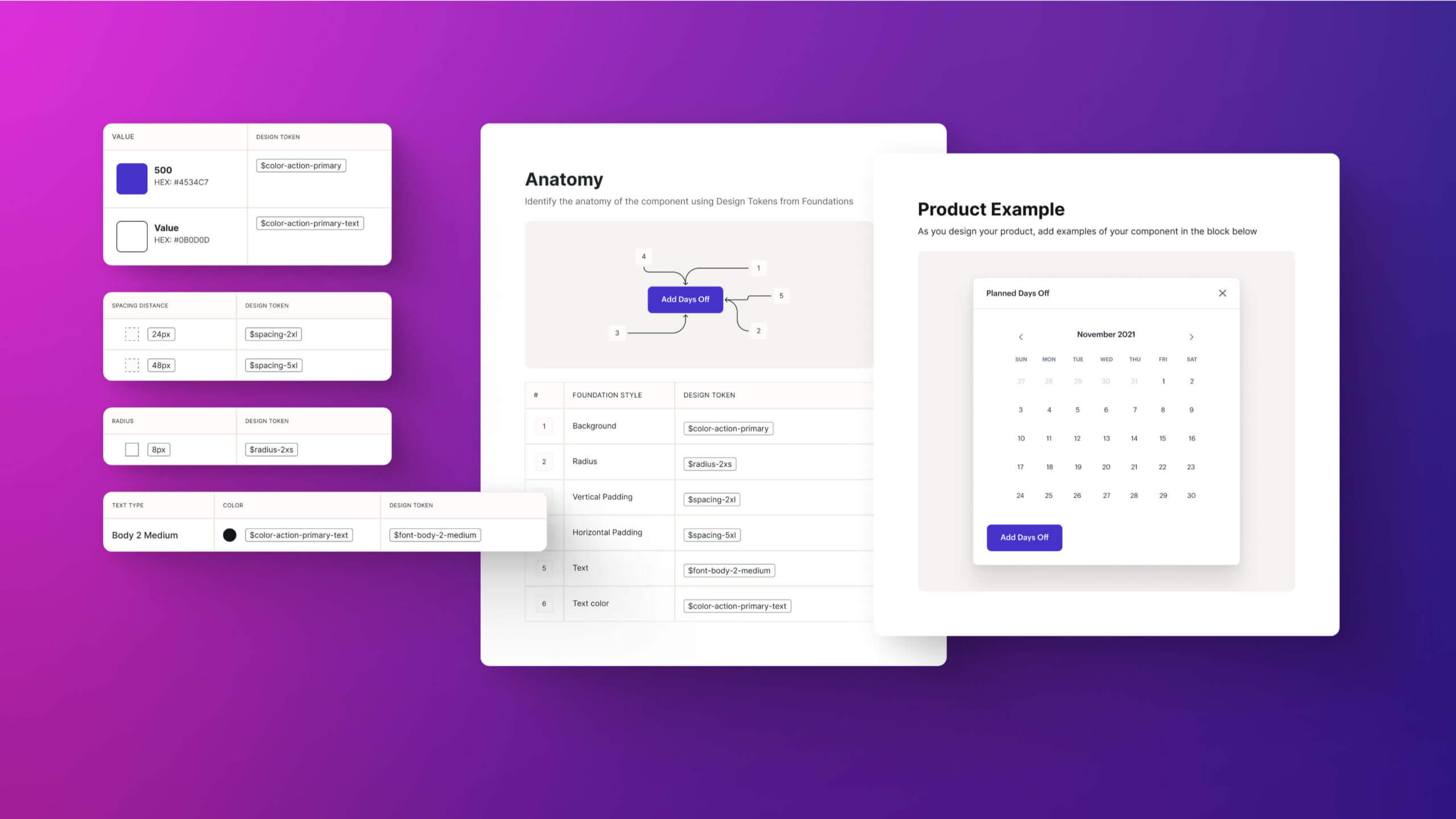
Foundational tokens like spacing, typography, and color come together to form consistent, reusable components that scale across the product
Challenges Navigated
Engineering Priorities Elsewhere
Most engineers were focused on Angular migration. I worked asynchronously, prioritized low-lift changes, and delivered fully documented specs to reduce dependency.
Token Sync Limitations
Figma lacked automated token sync to Bitbucket. I implemented a manual export strategy with clear naming conventions, ensuring engineers could map tokens without ambiguity.
Low System Familiarity
Many teammates were new to design systems. I linked usage to everyday workflows and showed concrete time savings to build momentum.
Single Codebase Migration
When Schedulicity migrated to a single codebase, our design system ensured UI consistency across both Schedulicity core and Ionic components. Tokens kept spacing, color, and type unified, reducing regressions and maintaining user trust during a risky transition.
Layoffs
During company-wide layoffs, I documented the system thoroughly so future teams could pick it up and continue without disruption.
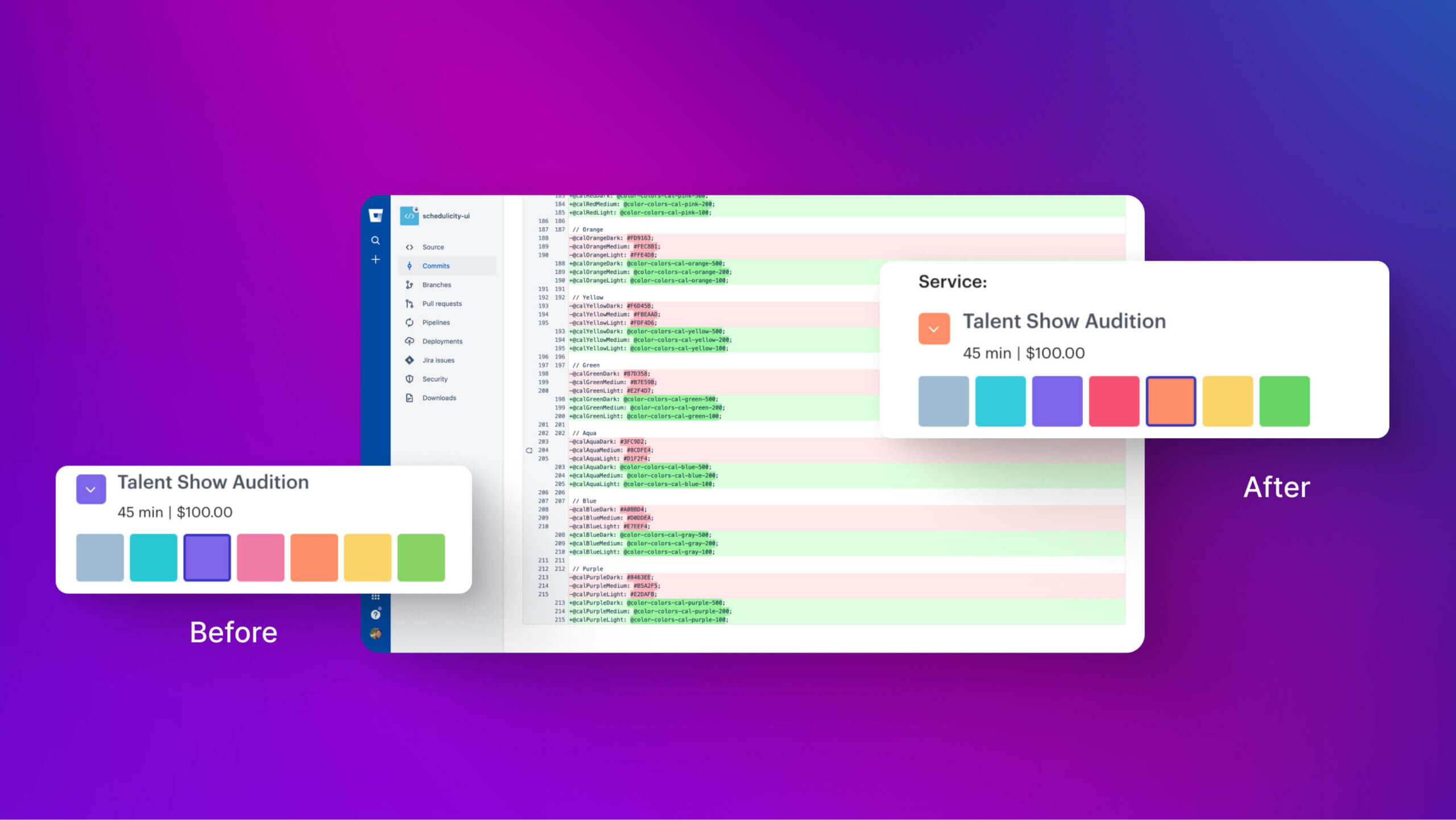
Calendar tokens defined to support new interface patterns
Results and Long-Term Impact
- Reduced inconsistencies between mockups and implementation with 1:1 design-to-code token structure
- Improved handoff efficiency and reduced QA churn through standardized specs and reusable patterns
- Governance safeguarded against drift, especially during the single codebase migration
- Improved accessibility with semantic tokens and WCAG-checked palettes
- Aligned Figma and code button components, reducing bloat and improving parity
- Created a fully documented, versioned system in Figma and Zeroheight that survived company-wide layoffs and remains scalable
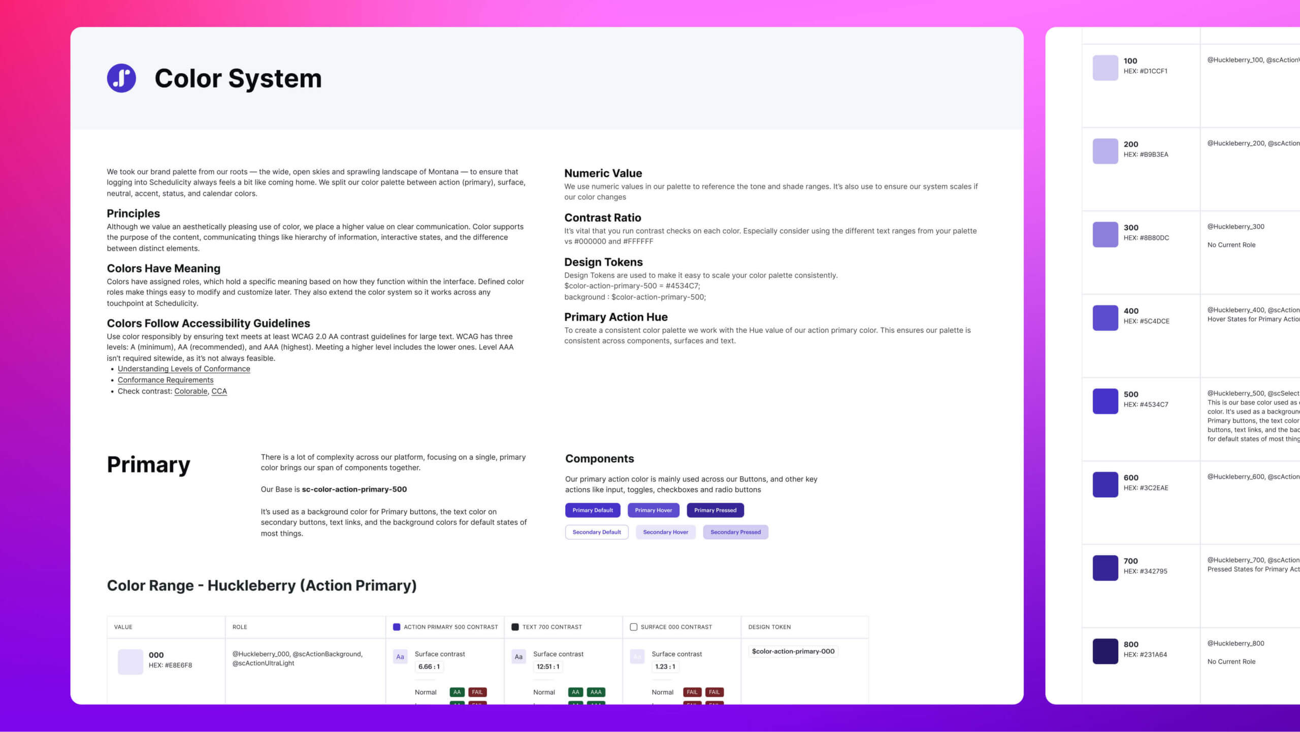
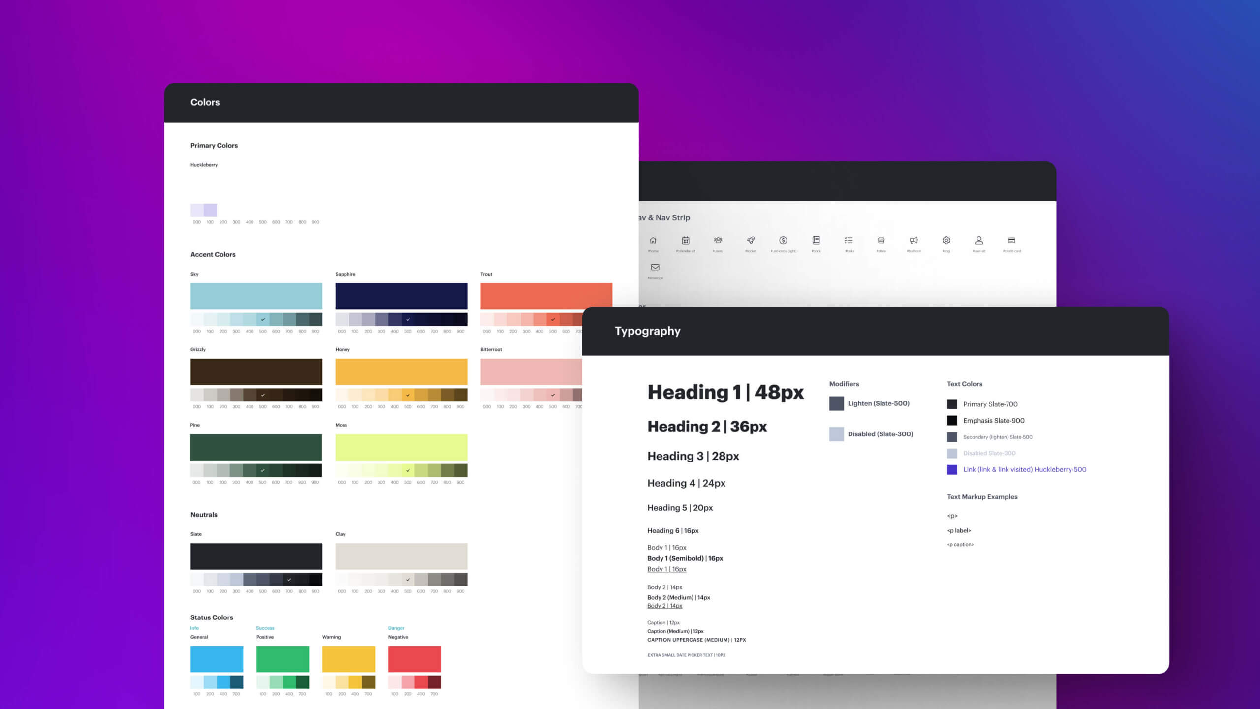
With so much complexity across our platform, focusing on a single primary color helped unify our entire component library
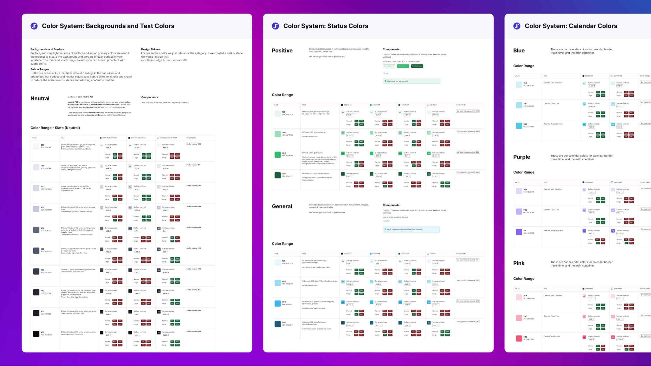
Schedulicity’s color palette was systematically developed in accordance with Brad Frost’s Atomic Design Methodology and adheres to all WCAG Level AA accessibility standards
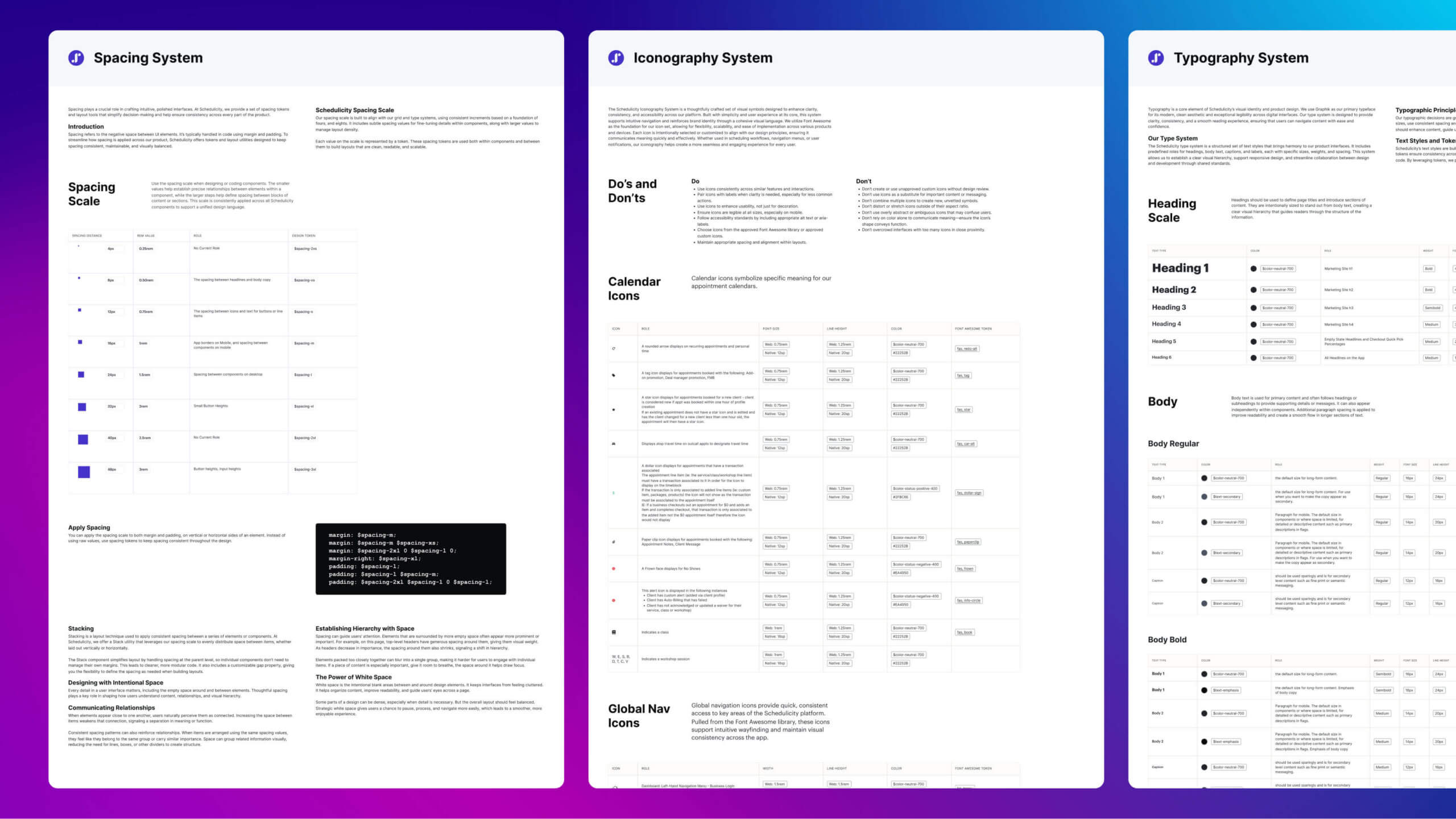
Foundational Tokens: Spacing, Iconography, and Typography: These core tokens establish the building blocks of Schedulicity’s design system, ensuring consistent padding, scalable icons, and harmonious text styles across every interface
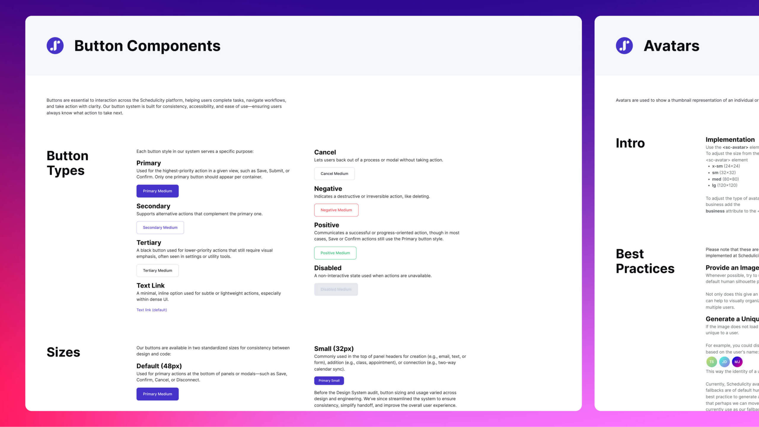
Buttons were originally structured as separate components for each type. I refactored them into a single, tokenized base component using variant properties like type, state, and icon presence—improving scalability and aligning with dev implementation
![]()
Documenting product examples, size variations, anatomy, and context ensures components are understood, used correctly, and adapted consistently across real-world scenarios
Reflection
What I Learned
- A design system is more than components—it’s governance, documentation, and alignment
- Tokens are the backbone of scalability, accessibility, and cross-platform consistency
- Education and adoption strategies are as critical as design and code
- Systems safeguard quality during technical transitions like codebase migrations
If I Had More Time
- Automate token sync between Figma and Bitbucket to eliminate manual updates
- Evolve the system into a modular platform shared across internal tools
This project deepened my passion for systems thinking and cross-functional collaboration. Even under resource and organizational constraints, the design system proved that thoughtful governance and token infrastructure can deliver scalable, long-term value for both teams and users.


