Executive Summary
I led the end-to-end UX design of Schedulicity’s first annual subscription plan, balancing strict legal and technical constraints with user needs for flexibility and trust. The launch improved retention, reduced reliance on costly acquisition, and gave the business more predictable revenue while significantly increasing user confidence in commitment flows.
Outcomes at a Glance
- 20 percent adoption of the annual plan within weeks of launch
- 25 percent increase in trial-to-paid conversion across all plans
- Significant reduction in subscription-related support tickets
- UX framework became the foundation for future billing and subscription features
Overview
Schedulicity’s Business platform was designed to support independent service providers and small business owners, including stylists, massage therapists, estheticians, and others. While the monthly subscription offered flexibility, it didn’t reward long-term users or support predictable growth. For a company serving small businesses, where churn risk is high and customer acquisition costs are significant, retention and recurring revenue were critical. We saw an opportunity to introduce an annual plan that would deliver better value to committed users while helping the business stabilize recurring revenue.
My Role
As the Product Designer on this project, I owned the end-to-end UX, from early discovery through handoff. I partnered closely with my Product Manager and collaborated cross-functionally with Engineering, QA, and Customer Experience (CX) to align across constraints and deliver a solution grounded in both user needs and business goals.
I led UX research, mapped critical flows, validated solutions with internal teams, and produced annotated, high-fidelity designs for implementation.
Before: Users were limited to a monthly plan with no long-term incentives, unclear upgrade paths, and minimal pricing transparency.
Discovery and Defining Business Goals
Before jumping into solutions, we ran a discovery phase focused on aligning objectives. I partnered closely with my Product Manager, who worked with leadership to define the high-level direction. On my side, I reached out to Data Analysts and Customer Experience (CX) to review subscription trends, revenue stability, and churn patterns. I also analyzed historical usage data and benchmarked against industry standards to understand where our opportunities lay. Together, these inputs clarified our goals: create a plan that incentivized long-term commitment, improved predictability, and aligned with user needs for flexibility and transparency.
The Problem
Schedulicity only offered monthly subscriptions, which worked for users testing our business platform but not for those ready to commit. There was no path to long-term value, and the lack of transparency around policies created confusion.
Our objectives were clear:
- Introduce an annual plan to reward loyalty
- Allow seamless upgrades from any state including trial, monthly, or canceled
- Make refund policies and pricing terms more transparent
- Remove friction from switching and reactivating plans
Process
We started by aligning on goals and reviewing the backend logic tied to billing, renewals, and proration. I mapped the entire user journey, from onboarding through upgrade and reactivation, to identify key moments of opportunity and risk.
My collaborators included:
- Product Manager — Partnered with me to define scope and worked with leadership and Support to clarify refund and downgrade policies
- Data Analysts — Helped validate opportunities through usage trends and industry benchmarks
- Customer Experience (CX) — Surfaced subscription-related confusion and friction from the support side
- Engineering — Worked with us to explore billing logic, backend limitations, and edge cases around upgrades
With a clear understanding of both objectives and user pain points, I began outlining flows and validating assumptions with cross-functional partners before moving into wireframing.
Trade-offs & Decisions
Before wireframing, we had to balance business constraints, user expectations, and technical feasibility. These were the key trade-offs we navigated:
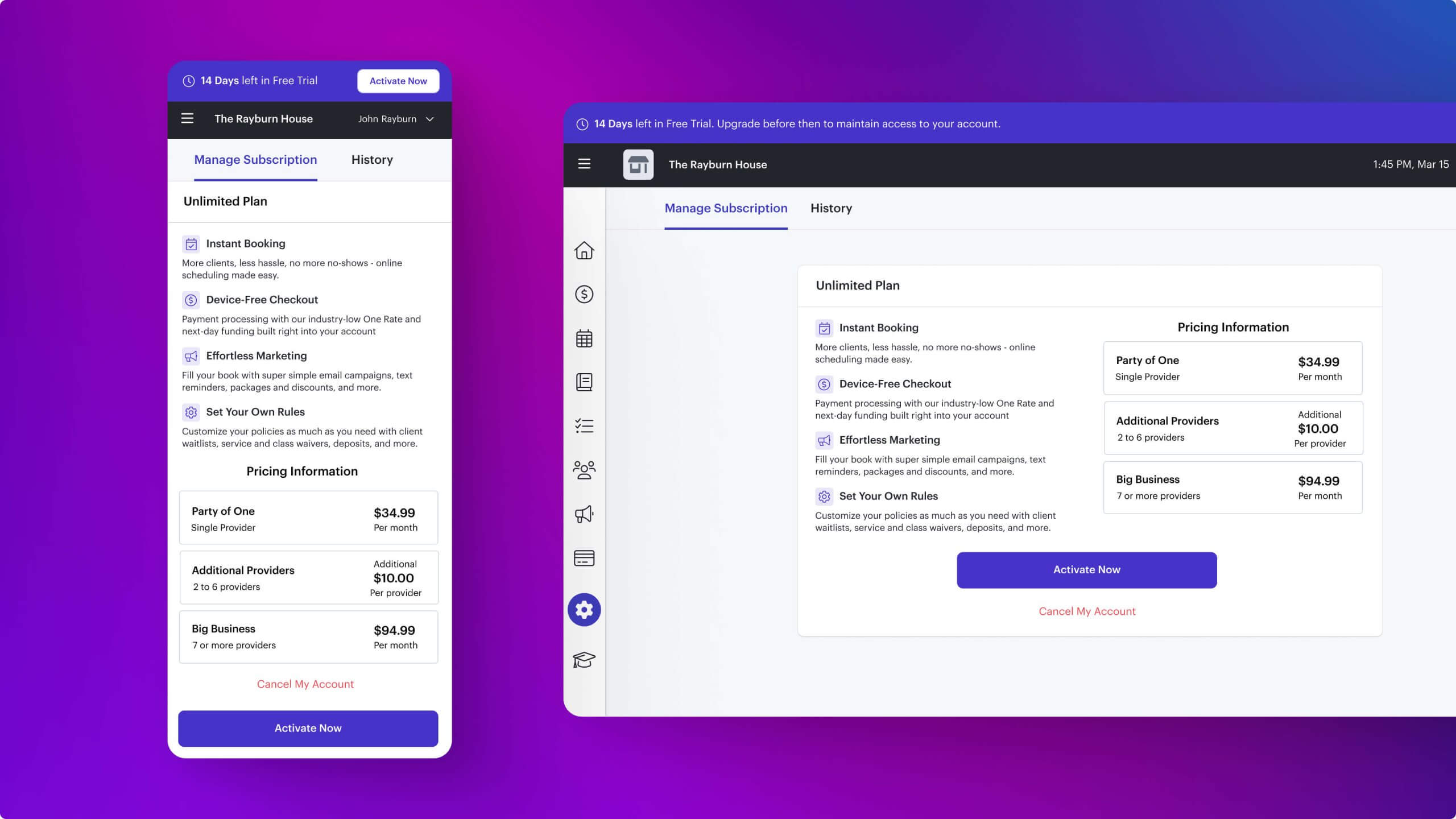
- Legal vs. Usability — Annual subscriptions had to be non-refundable, and once upgraded, businesses could not downgrade until two weeks before renewal. To mitigate frustration, I made these terms highly visible in the flow and terms of service, added inline alerts, and designed a push notification sequence one month and two weeks before renewal to ensure users were fully informed.
- Timing of the Upgrade Prompt — Leadership pushed for earlier conversions, but research showed users weren’t ready during registration or trial. While we optimized for post-trial adoption, we still designed upgrade entry points at registration and during free trial to allow flexibility for early adopters.
- Engineering Complexity vs. User Experience — Proration, reactivation, and downgrade logic introduced edge cases. To keep scope realistic, we limited downgrades to two weeks before renewal, while making the flow clear and predictable for users.
- Transparency vs. Conversion Risk — Clear refund and downgrade limitations could discourage some sign-ups. I chose to surface these policies upfront to build trust and reduce long-term churn and support tickets.
- Incentives vs. Revenue Predictability — A 16% discount reduced short-term revenue but encouraged long-term commitments. We tested this at the optimal upgrade moment (after 2–3 months) to balance user adoption with financial stability.
By framing and addressing these trade-offs early, we aligned business priorities with user needs and ensured wireframes reflected feasible, trustworthy solutions.

Before: The user journey lacked clear upgrade moments and flexibility, leading to missed opportunities for commitment.
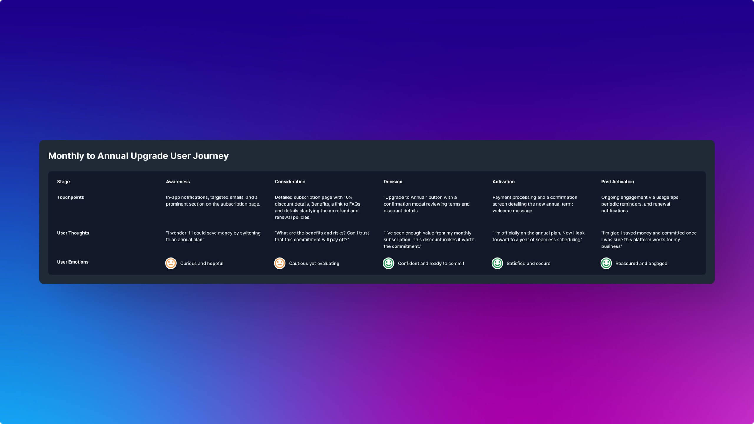
What We Learned from UX Research
To shape the experience and ensure we were solving the right problem, I led a mixed-methods research approach that combined qualitative insights with behavioral data.
- User interviews — Service providers told us they would only commit to an annual plan after fully experiencing the platform’s value.
- CX and Intercom feedback — Reinforced demand for an annual subscription option, especially since most B2B platforms offered them with discounted pricing.
- Behavioral data — Confirmed that users were most likely to upgrade two to three months after starting on a monthly plan.
- Competitive analysis — Helped us benchmark pricing and structure the offer in a way that felt familiar but still flexible.
We then used research to understand how user needs aligned—or clashed—with business goals. Service providers made it clear that they valued flexibility above all else, and wouldn’t commit without trust in the platform. Their need for transparent policies and a clear upgrade path directly shaped how we balanced commitment incentives with usability.
User Problem Statement
Independent service providers needed a flexible, cost-effective subscription option because they wanted to commit long-term only after experiencing the platform’s value. However, the existing monthly-only model offered no incentive for loyalty and no clear path to upgrade. This led to missed opportunities for commitment and increased churn.
Refined user journey: Monthly users were guided toward upgrading to an annual plan after 2–3 months of engagement, with clear prompts, transparent pricing, and prorated billing.
Finding the Right Moment
We tested three entry points for introducing the annual plan:
- At Registration — Too soon. Users were not ready to commit to a long-term plan without trying the product first.
- During Free Trial — Still too early. Fourteen days was not enough time for most users to feel confident making the switch.
- Post-Trial (Monthly Users) — This was the strongest conversion point. Users who had experienced the platform over time were more likely to commit to an annual plan.
We focused our design efforts on this sweet spot, adding a 16 percent discount as an incentive and surfacing the upgrade prompt when users were most engaged.
Designing the Experience
Because annual subscriptions were non-refundable and users could not downgrade until two weeks before renewal, I prioritized transparency and reassurance at every touchpoint. The experience needed to be clear, informative, and frictionless.
Happy Paths
- Upgrade from monthly to annual with prorated pricing
- Upgrade from trial to annual with 16 percent discount offer
- Reactivate a canceled plan without losing subscription history
- Apply promo codes and see savings reflected in real time
Sad Paths and Edge Cases
- Declined payment methods with retry flow
- Expired or invalid promo codes with helpful error states
- Incomplete payment info triggering clear, inline validation
- Misunderstandings about refund or downgrade limitations
A persistent banner during the free trial showed days remaining, which reinforced upgrade options without disrupting the experience.
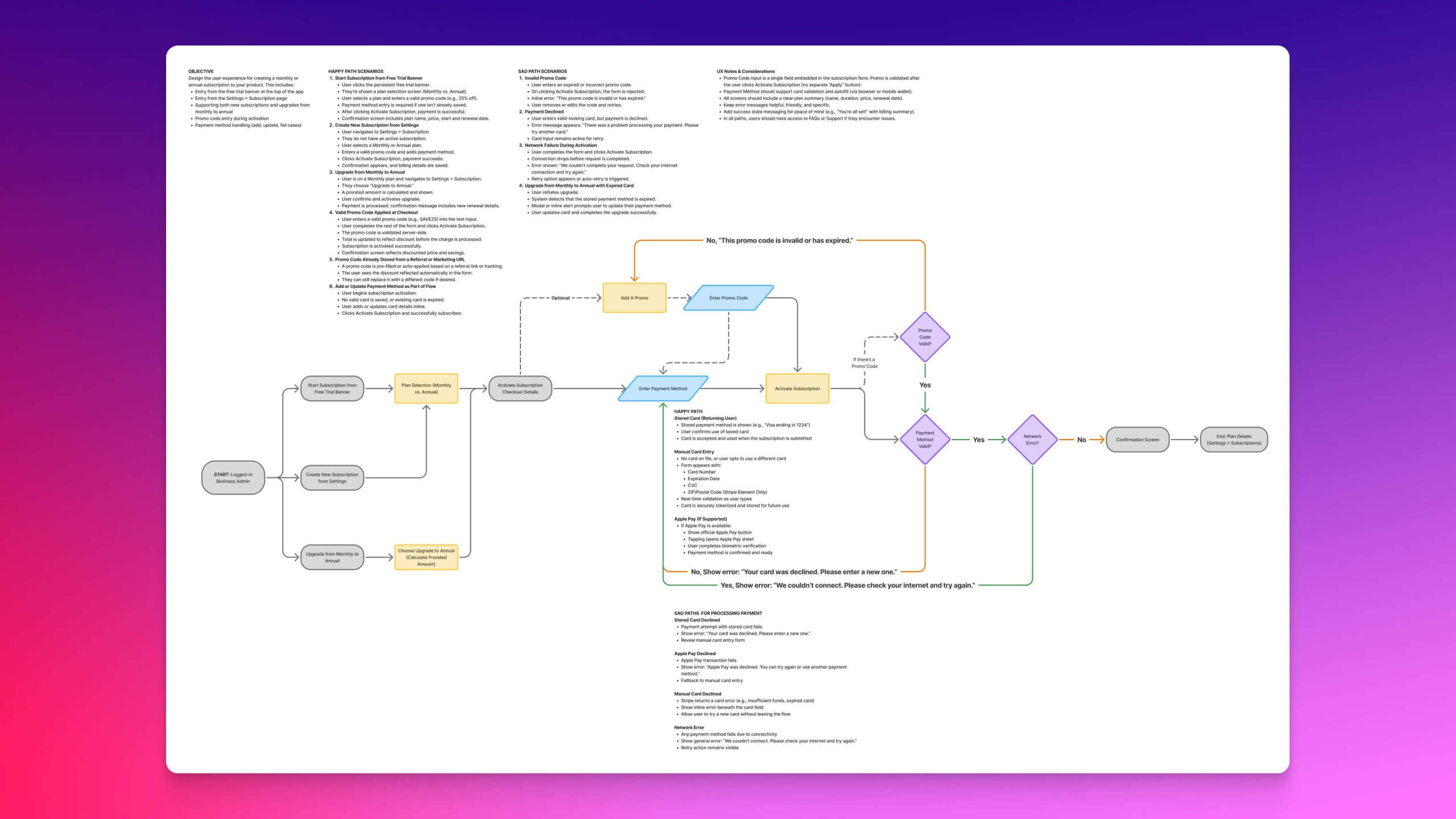
Three upgrade entry points were designed to meet users where they were: during onboarding, within the trial period, and most successfully after a few months on a monthly plan.
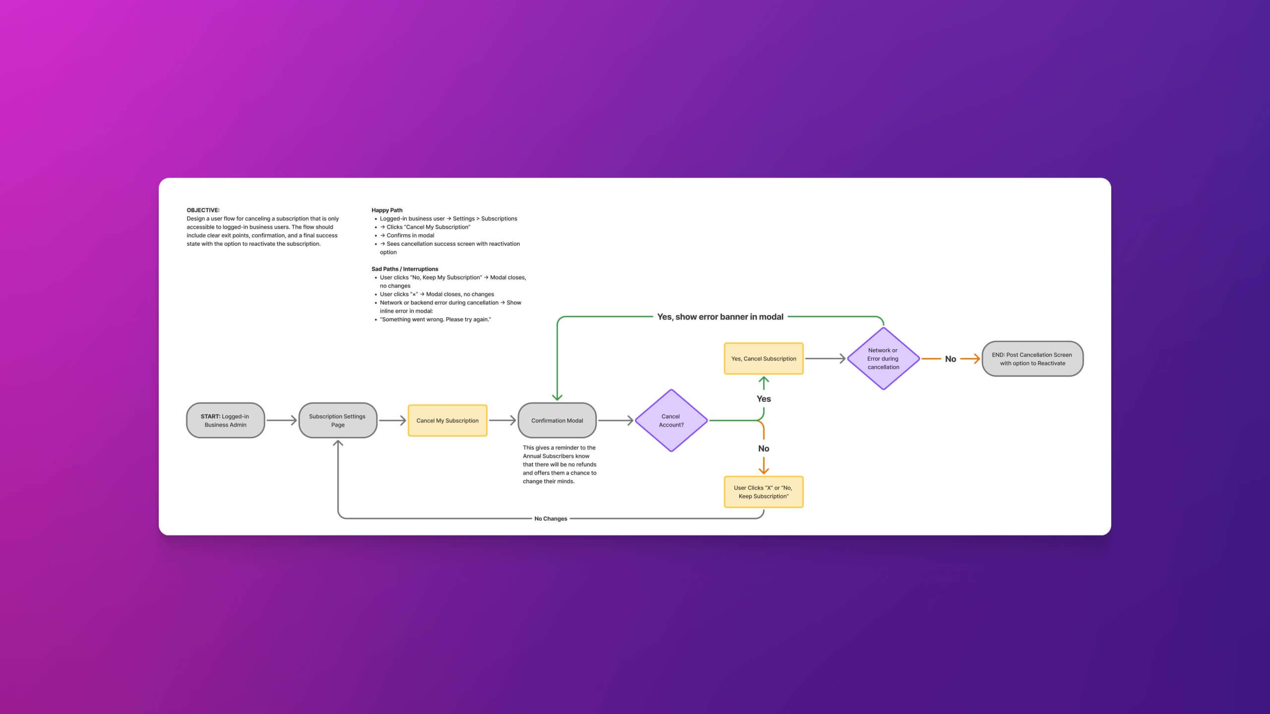
The cancellation flow guided users through key policy reminders, including non-refundable terms and downgrade restrictions, to ensure clarity and reduce support burden.
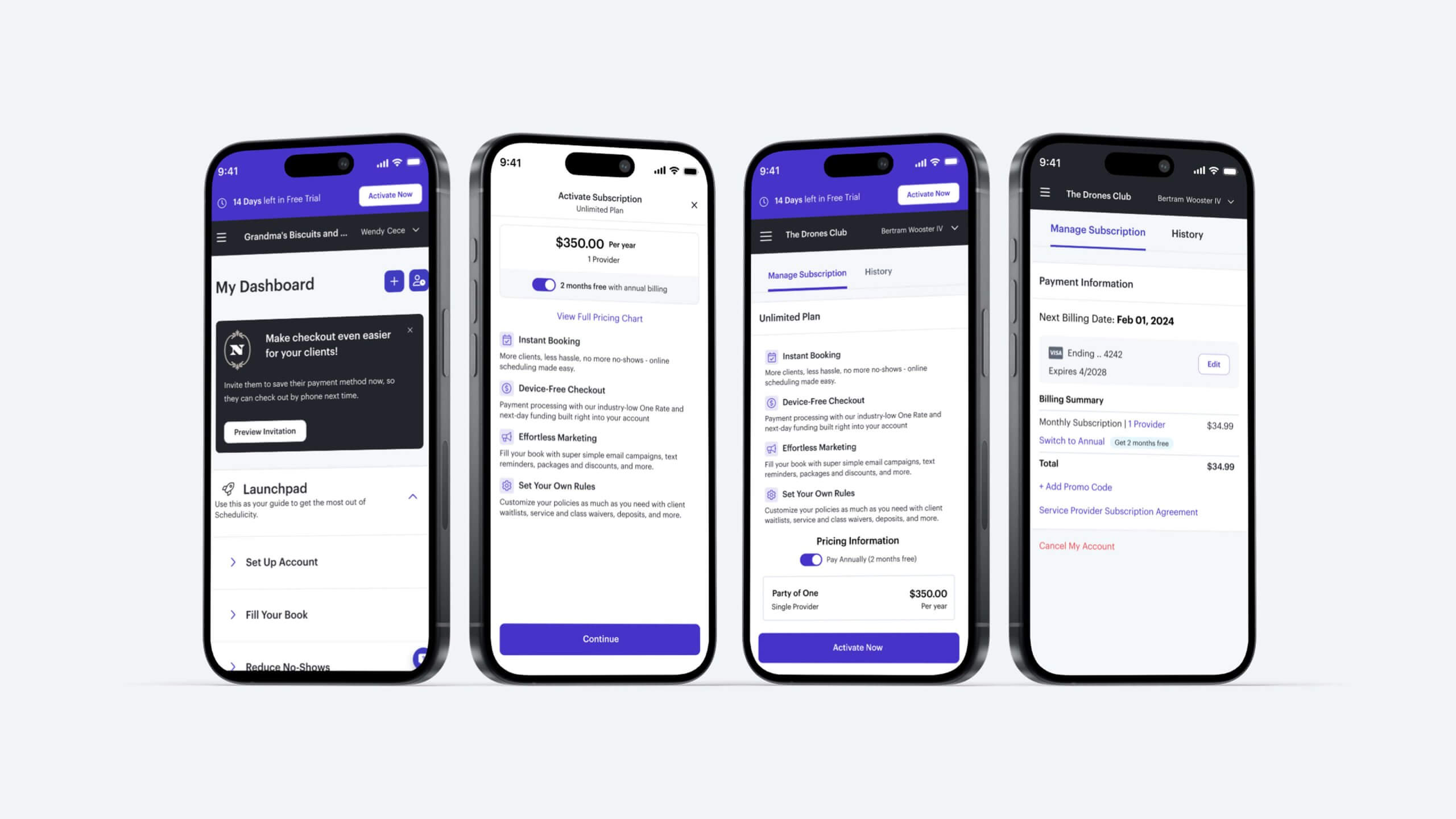
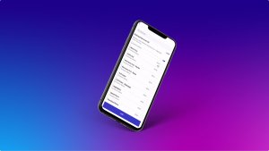
High-fidelity mockups showing three logged-in upgrade paths to an annual subscription. Left two mocks: During onboarding within the free trial experience. Third Mock: Creating An Annual Subscription from the Settings > Subscriptions Page. Right: Switching from monthly to an annual subscription.
Building for Trust
Given the commitment required, clarity was essential. I designed:
- Plan comparison views that clearly outlined savings and commitment length
- Modal confirmations that surfaced refund and downgrade policies before purchase
- Inline alerts and tooltips throughout the flow to reduce ambiguity and build confidence
This emphasis on transparency helped reduce support volume and improve user satisfaction.
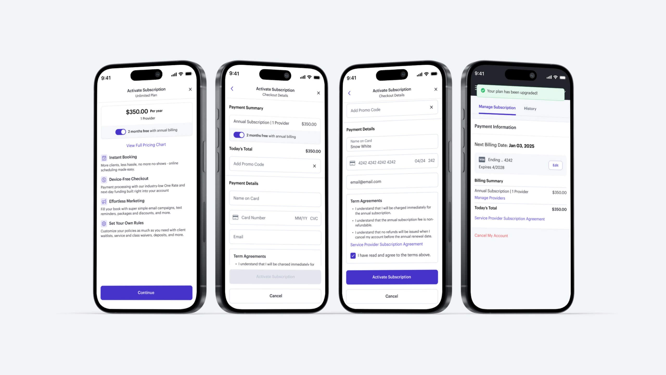
The primary annual subscription flow guided users through selecting an annual plan with clear pricing, commitment terms, and confirmation steps designed to build trust and reduce friction.
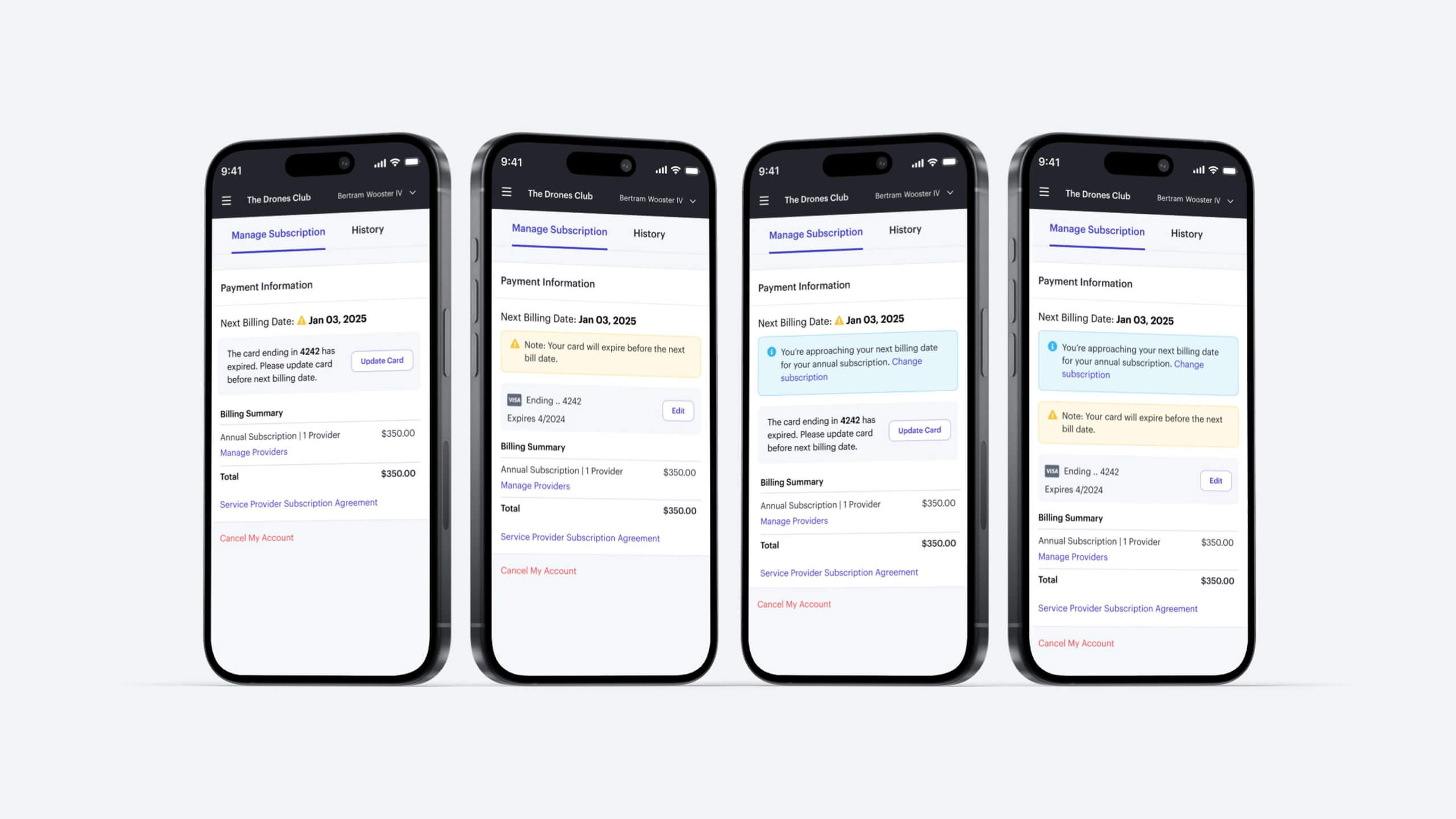
Inline alerts proactively notified users when their payment methods were expired or would expire before renewal, and reminded them of upcoming renewals two weeks in advance to reduce failed payments and support issues.
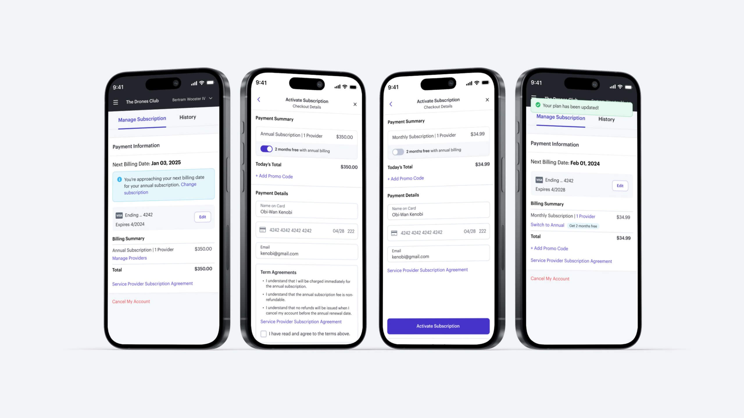
The flow to switch from annual to monthly was only available two weeks before renewal and included clear messaging about commitment terms, helping users make informed decisions without confusion.
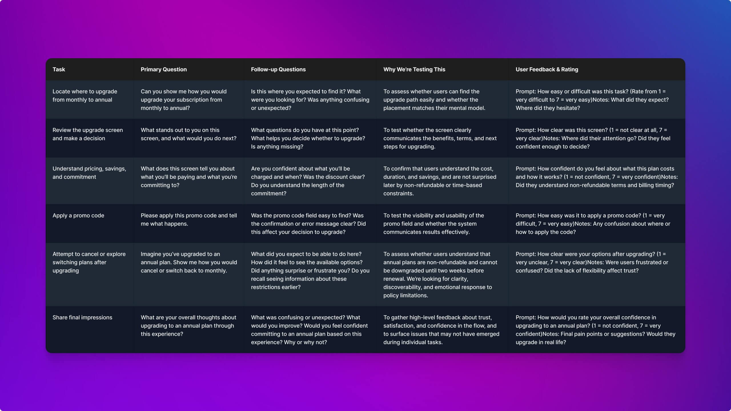
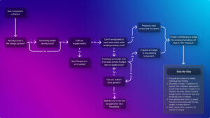
Usability testing plan outlining key tasks and questions to evaluate upgrade clarity, pricing comprehension, policy transparency, and emotional responses throughout the annual subscription flow
Impact
Business Outcomes
- 20 percent adoption of the annual plan shortly after launch
- Approximately 25 percent lift in trial-to-paid conversion across all plans
- The framework we built became the foundation for future billing features
- Improved retention reduced reliance on costly acquisition and gave the business more predictable revenue streams
User Outcomes
- Significant drop in subscription-related support tickets
- Improved clarity around pricing, refund policies, and upgrade paths
- Higher user confidence in committing to long-term plans
Validating Business Goals and User Needs
To ensure we delivered on both sides, we validated through:
- Usability testing — Confirmed that users clearly understood refund policies, pricing transparency, and upgrade options.
- Behavioral analytics — Post-launch adoption patterns aligned with predicted upgrade windows (2–3 months in).
- Support ticket analysis — Measured a significant drop in subscription-related confusion, validating that policies were easier to understand.
Together, these methods proved that the annual plan supported business goals while meeting user needs for transparency and confidence.
Prototype Demonstration
To supplement this case study, I built an interactive prototype in Figma Make. This wasn’t part of the production flow, but rather a demonstration to explore how AI tooling could accelerate prototyping, validate edge cases, and make the subscription journey easier to communicate in a case study format.
Explore the full checkout flow. Use 4242424242424242 for success, 5431111111111228 for decline, SKYWALKER for a valid promo, and DARTHVADER25 for an invalid one.
Reflection
This project reinforced the importance of designing for trust under strict constraints. I learned that aligning on trade-offs early with Product, Engineering, and CX reduced downstream design debt and ensured feasibility while still advocating for users. It also showed me the value of surfacing policies transparently, even when it introduced conversion risk, because trust ultimately drove adoption and reduced churn.
If I could take it further, I would explore A/B testing the timing of upgrade prompts to fine-tune conversion, and enhance the existing subscription center to provide clearer visibility into renewal timelines, downgrade eligibility, and payment policies.