Executive Summary
I led the creation of Schedulicity’s first design system, bringing structure and consistency to the way the product was designed and built. I established the design foundations, created reusable components, developed the design token taxonomy, and introduced governance that helped designers and engineers work from a shared source of truth.
Working within the technical architecture established by our Principal Data Architect, I partnered closely with front-end engineers to ensure design tokens mapped cleanly into the existing Angular UI library. The result was a more consistent user experience, improved accessibility, clearer handoffs between design and engineering, and stronger support for the company’s migration to a unified Angular codebase.
Outcomes at a Glance
- Led the creation of Schedulicity’s first design system.
- Developed a semantic design token taxonomy for color, spacing, typography, and iconography.
- Partnered with front-end engineers to align design tokens with the Angular UI library.
- Standardized component documentation, reducing implementation questions and improving QA.
- Built an accessible color system that met WCAG guidelines.
- Introduced a consistent 4px spacing scale across the design system.
- Supported the migration to a unified Angular codebase by providing shared design foundations.
- Created documentation and governance practices that encouraged long-term adoption.
Before: A fragmented design landscape with inconsistent components and visual drift
The Challenge
When this initiative began, Schedulicity did not have a centralized design system. Design files were spread across multiple documents, components had evolved independently, and teams often solved the same problems in different ways. Colors, typography, spacing, and component behavior were inconsistent across the product, making it difficult to maintain a cohesive user experience.
At the same time, engineering was migrating the application to Angular and working toward a unified codebase. Without shared design foundations, that transition risked introducing additional inconsistencies and increasing implementation effort.
The opportunity was not simply to build a component library, but to establish a shared language that designers and engineers could use to create, document, and implement interface decisions consistently.
My Role
As Senior UX/UI Designer, I led the design system initiative from discovery through adoption. I was responsible for creating the design foundations, defining the token taxonomy, designing reusable components, documenting standards, establishing governance, and driving adoption across the organization. Working within the technical architecture established by our Principal Data Architect, I partnered closely with front-end engineers to ensure the system could be implemented consistently within the Angular application.
That work included:
- Auditing the existing interface to identify inconsistencies and opportunities for standardization.
- Creating the design token taxonomy for color, spacing, typography, and iconography.
- Designing reusable components and defining their behavior and usage.
- Writing implementation guidance and documentation for designers and engineers.
- Collaborating with front-end engineers to align design decisions with implementation.
- Building accessibility into the system from the beginning.
- Leading adoption through documentation, design reviews, presentations, and team collaboration.
Team
This was a cross-functional effort involving design, engineering, research, and product leadership.
- Front-end web engineers
- iOS and Android engineers
- Principal Data Architect
- UX Research
- Product Designers
- Head of UX, acting as Product Owner
I led the design system initiative, including the design foundations, token organization, reusable components, documentation, governance, and adoption strategy. The Principal Data Architect established the technical architecture, while front-end engineers integrated the design system into the Angular UI library. UX Research helped validate interaction patterns and usability throughout the project.
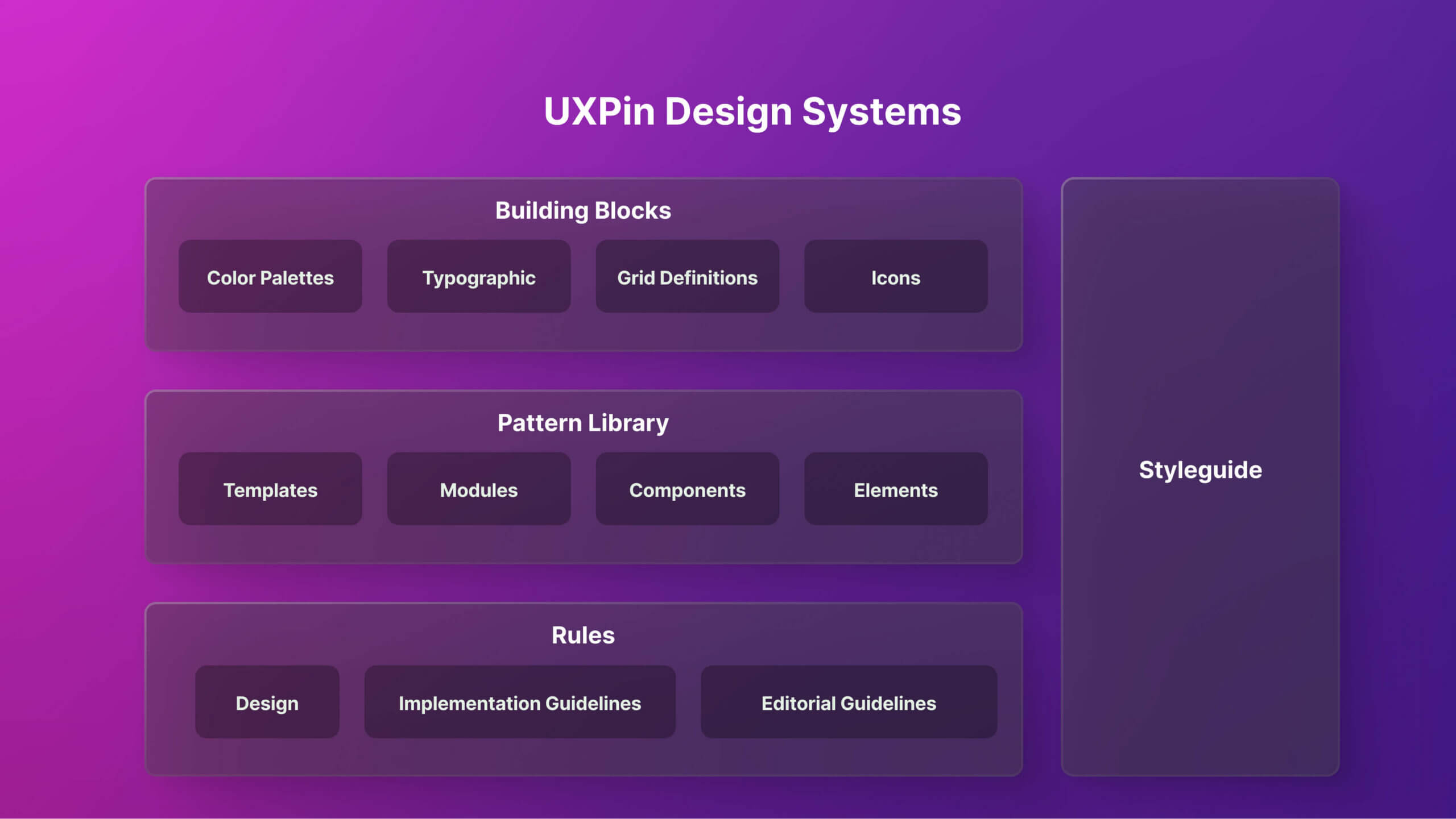
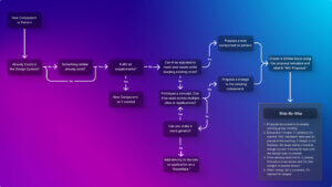
Organizing our early audit in UXPin helped visualize structure and plan rollout before fully transitioning to Figma and Zeroheight
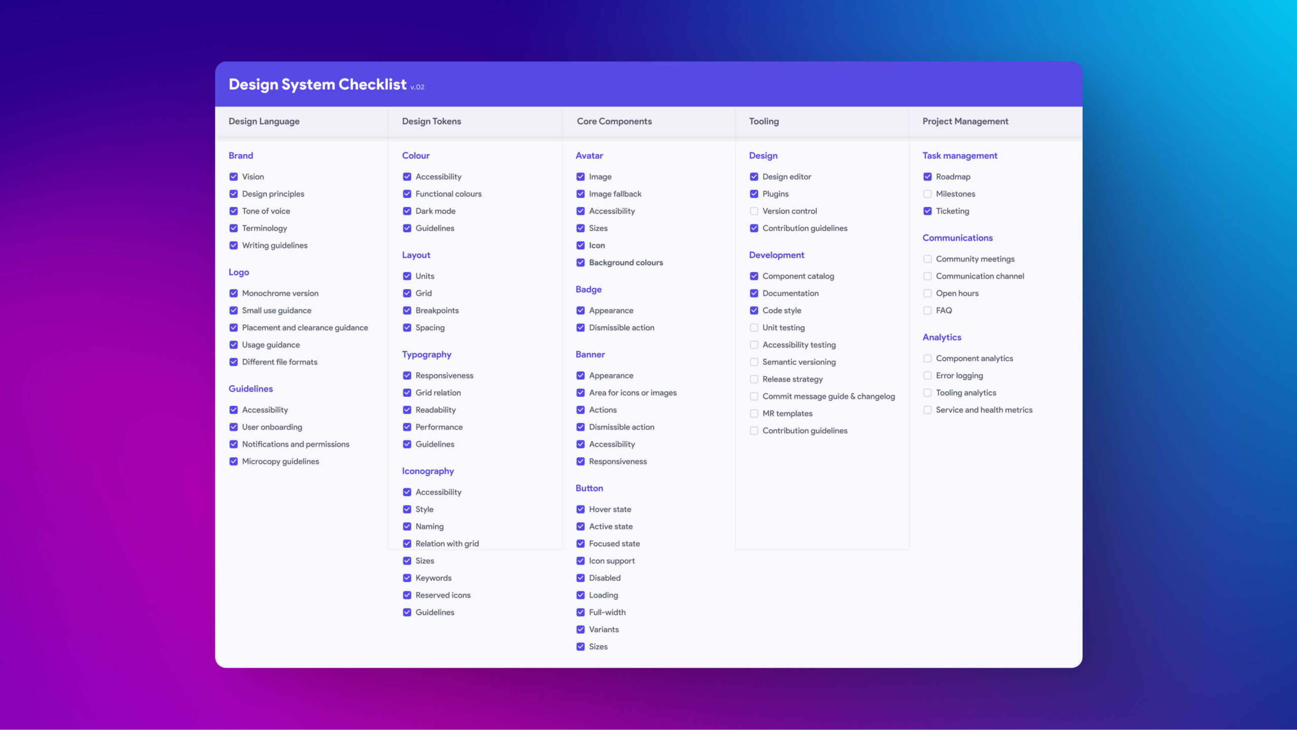
System checklist used for design reviews and QA
Discovery and Planning
Before designing components, I needed to understand where the product was inconsistent and which improvements would have the greatest impact. I began by evaluating the existing interface, meeting with designers and engineers, and identifying opportunities to create a shared design language that could scale with the product.
That work included:
- Auditing the interface to identify duplicate components, inconsistent patterns, and accessibility issues.
- Interviewing designers and engineers to understand existing workflows, pain points, and implementation challenges.
- Defining a phased rollout strategy that focused on delivering value quickly while supporting long-term adoption.
- Building early support through documentation, design reviews, and working sessions with cross-functional teams.
This discovery work established a roadmap for the design system and helped ensure the first release addressed the team’s most immediate needs.
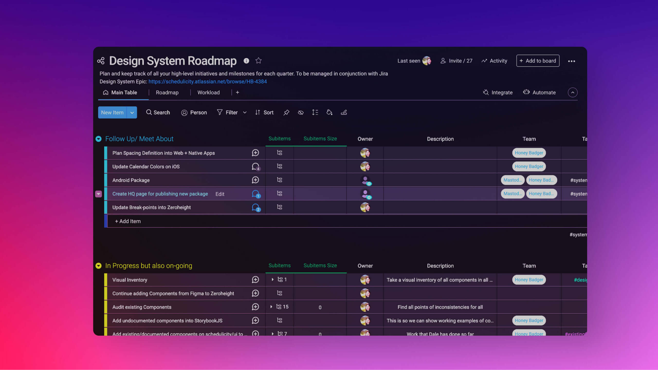
Roadmap outlining the phased implementation strategy for the design system
Building the Foundations
With a clear understanding of the product, I established the foundational design decisions that every component would rely on. Rather than treating colors, spacing, and typography as isolated values, I organized them into reusable design tokens that could be shared across the system.
Color
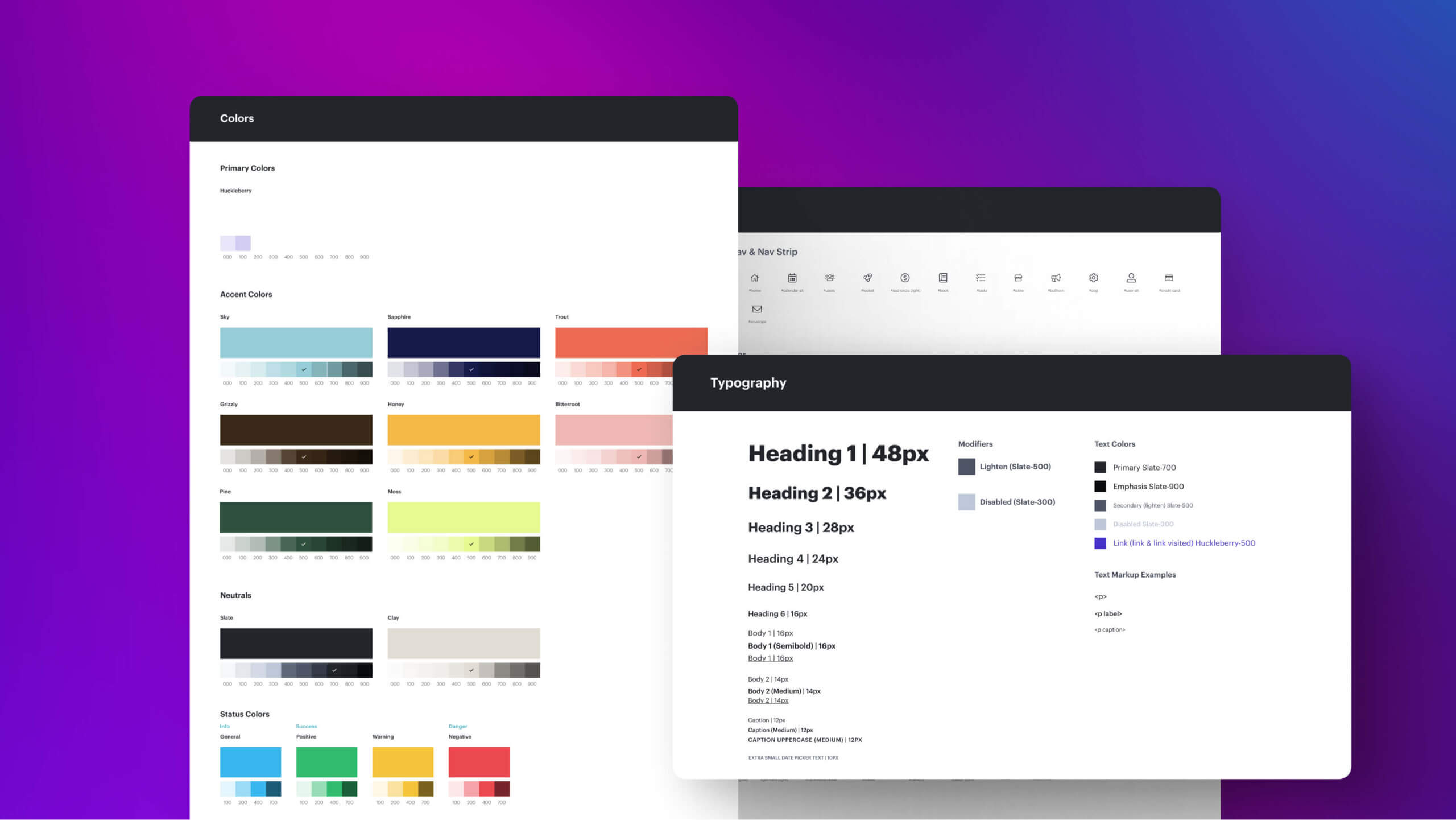
I created a semantic color system that organized the palette by purpose rather than individual color values. Tokens such as Primary Action, Success, Warning, Error, and Background created a consistent language for both designers and engineers while supporting accessibility throughout the product.
Spacing
I introduced a consistent 4px spacing scale using t-shirt sizing to create predictable layouts and simplify implementation across the application.
Typography
I established semantic typography tokens such as Heading Large and Body Small so components referenced meaning instead of fixed pixel values, making future updates easier to manage.
Iconography
I standardized icon usage around Font Awesome and aligned naming conventions with engineering to improve consistency between design and implementation.
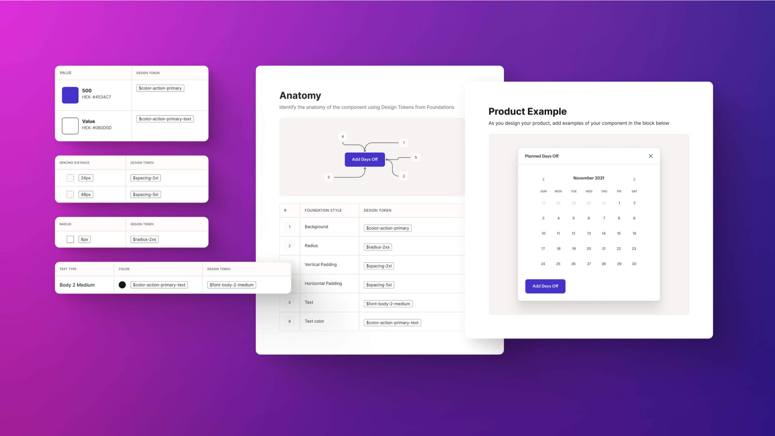
Foundational tokens like spacing, typography, and color come together to form consistent, reusable components that scale across the product
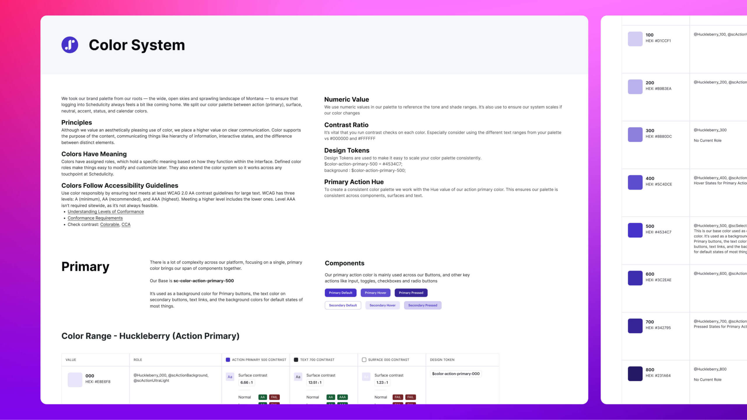
With so much complexity across our platform, focusing on a single primary color helped unify our entire component library
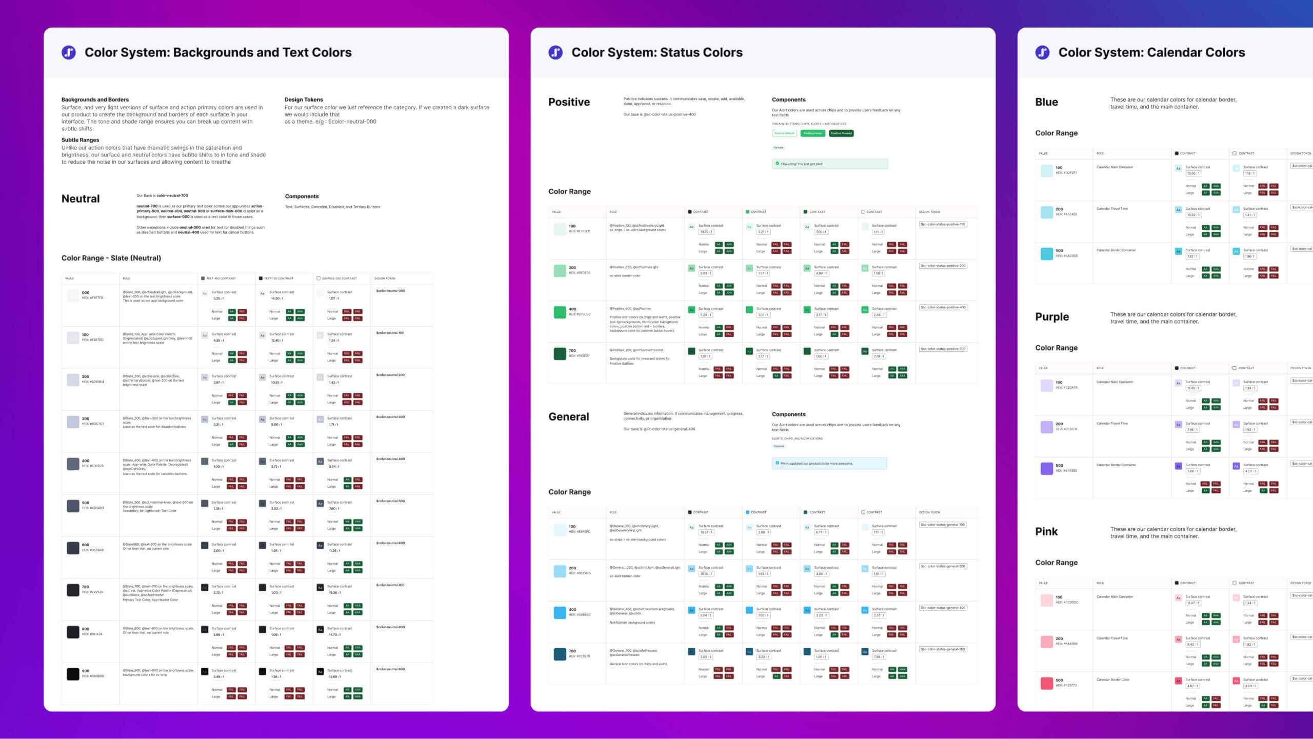
Schedulicity’s color palette was systematically developed in accordance with Brad Frost’s Atomic Design Methodology and adheres to all WCAG Level AA accessibility standards
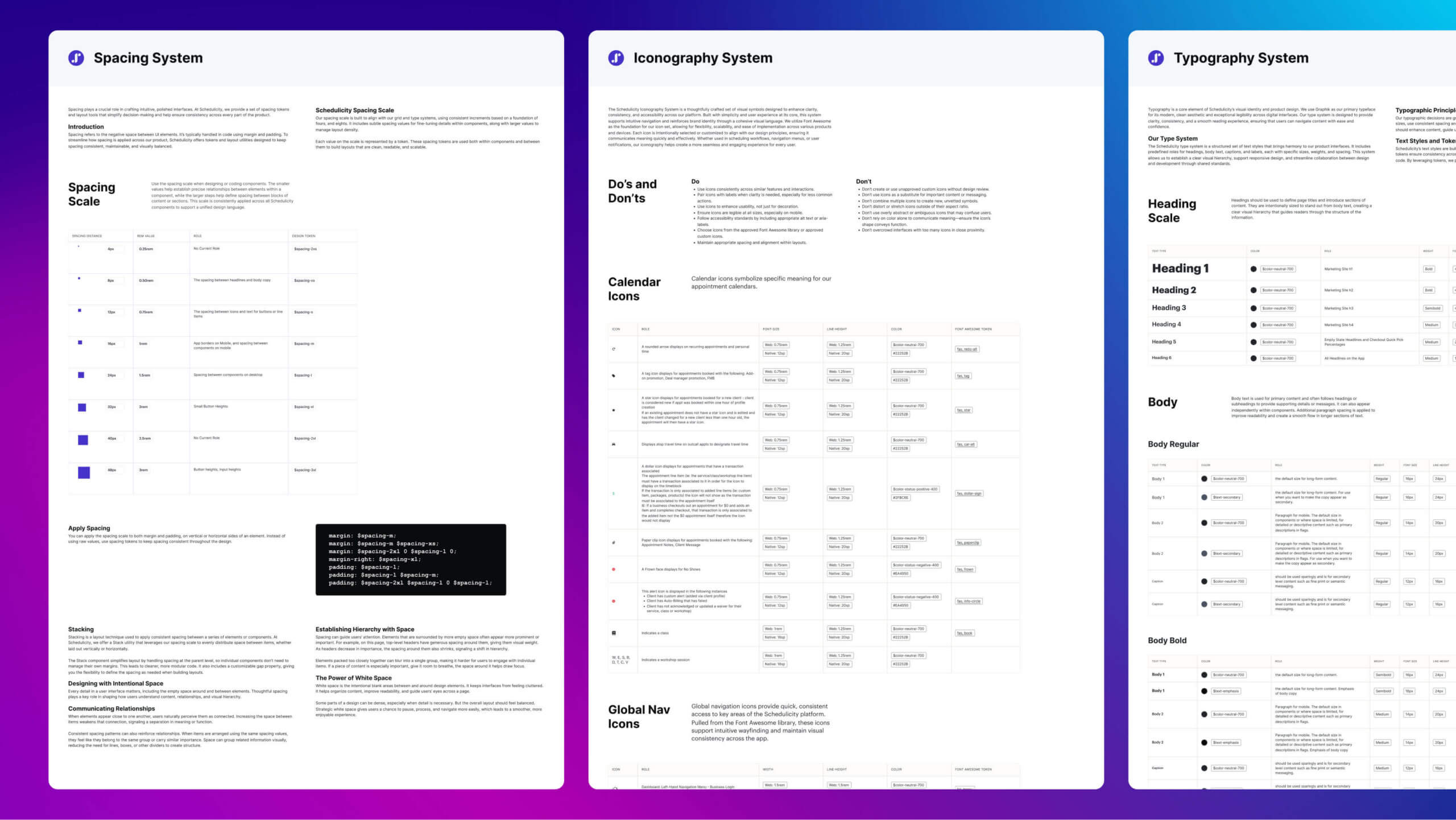
Foundational Tokens: Spacing, Iconography, and Typography: These core tokens establish the building blocks of Schedulicity’s design system, ensuring consistent padding, scalable icons, and harmonious text styles across every interface
Design to Code
One of the primary goals of the design system was improving the relationship between design and development. While I did not define the technical architecture, I worked closely with our Principal Data Architect and front-end engineers to ensure the design foundations aligned with the existing implementation.
Design tokens created in Figma were exported as JSON and transformed into LESS variables using Style Dictionary before being consumed by the Angular UI library. This established a consistent structure that reduced ambiguity between design and development while making updates easier to manage.
Although parts of the workflow remained manual, the process created a reliable connection between design decisions and implementation. Designers and engineers shared a common language, making handoffs more predictable and reducing inconsistencies across the application.
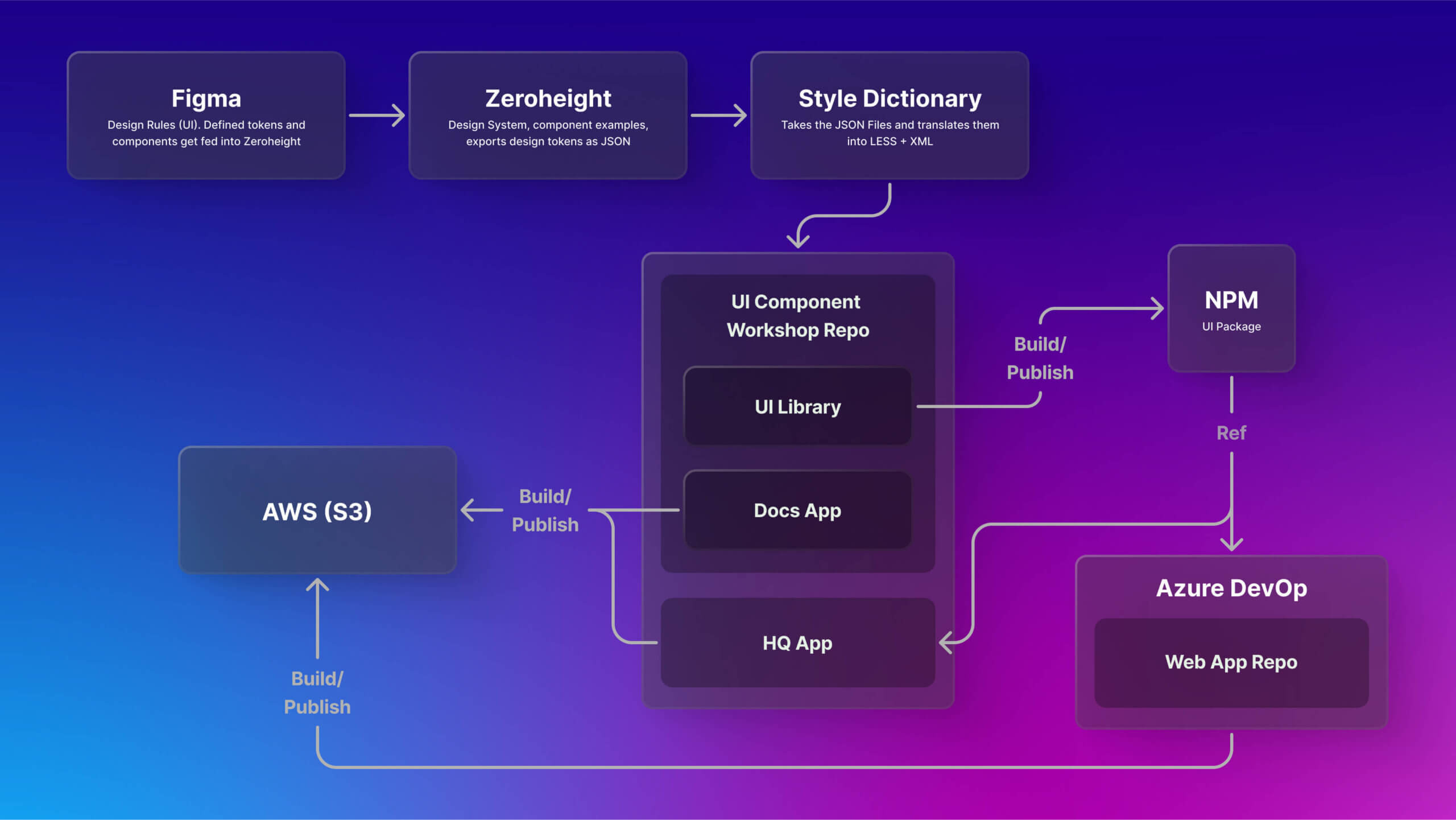
Design tokens flow from Figma to code using Style Dictionary
Components and Documentation
With the design foundations in place, I focused on creating reusable components that were flexible, accessible, and easy for both designers and engineers to understand. Documentation was treated as an essential part of every component, ensuring the system could scale beyond its initial release.
That work included:
- Designing reusable components that referenced design tokens instead of hardcoded values.
- Defining component anatomy, behavior, accessibility requirements, and usage guidelines.
- Creating flexible variants that supported different states and use cases.
- Documenting components in Figma and Zeroheight so design and engineering shared the same reference.
- Reviewing implementation with engineering to maintain consistency between design and code.
One example was the button component. I removed an unused size, corrected spacing differences between design and implementation, and reorganized the component into a more scalable structure using variants instead of separate components. This simplified maintenance while improving parity between Figma and the Angular application.
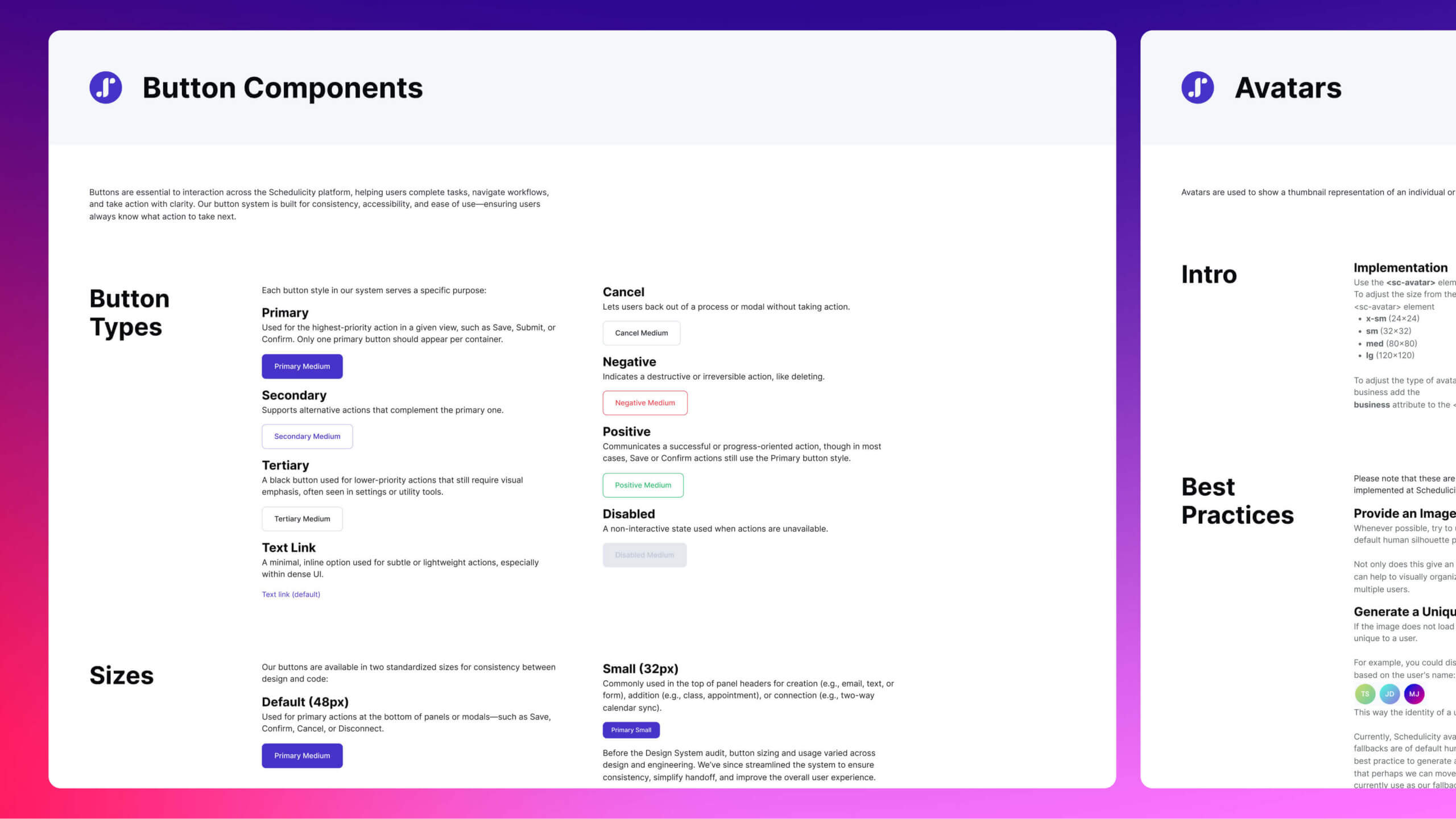
Buttons were originally structured as separate components for each type. I refactored them into a single, tokenized base component using variant properties like type, state, and icon presence—improving scalability and aligning with dev implementation
Governance and Adoption
A design system only creates value when people trust it and use it consistently. Beyond creating components, I established processes that helped the system evolve without losing consistency over time.
That work included:
- Creating a governance process for proposing, reviewing, and approving design system changes.
- Establishing documentation standards that kept design and engineering aligned.
- Publishing release notes and usage guidance in Zeroheight.
- Leading onboarding sessions, design reviews, and working sessions to encourage adoption.
- Providing ongoing support as teams incorporated the design system into their everyday workflows.
These practices helped the design system become part of the team’s workflow instead of simply another design file. By combining documentation, governance, and collaboration, the system remained consistent while continuing to evolve alongside the product.
Challenges
Building Schedulicity’s first design system required balancing long-term goals with the realities of an evolving product and changing business priorities. Rather than waiting for ideal conditions, I focused on creating a system that delivered immediate value while supporting future growth.
Supporting the Angular Migration
Engineering’s primary focus was migrating the application to Angular and consolidating multiple codebases. To avoid slowing that effort, I delivered implementation-ready documentation, collaborated asynchronously whenever possible, and prioritized changes that could be adopted incrementally.
Connecting Design and Development
At the time, there was no fully automated workflow for synchronizing design tokens between Figma and the codebase. Working with front-end engineers, we established a consistent process for organizing, exporting, and implementing tokens that reduced ambiguity and improved consistency across the application.
Building Adoption
Many team members had never worked with a formal design system. Instead of introducing additional process, I demonstrated how reusable components, documentation, and shared standards could reduce repetitive work and improve collaboration. Showing practical value helped build confidence and encourage adoption.
Maintaining Consistency During Change
As the product moved toward a unified Angular codebase, the design system provided a consistent visual language across both Schedulicity and Ionic components. Shared design tokens and reusable components helped reduce visual drift throughout the migration.
Documenting for the Future
During company-wide layoffs, I prioritized documentation so the design system could continue evolving even if team members changed. Clear guidance and governance helped preserve knowledge and reduced the risk of the system becoming difficult to maintain.
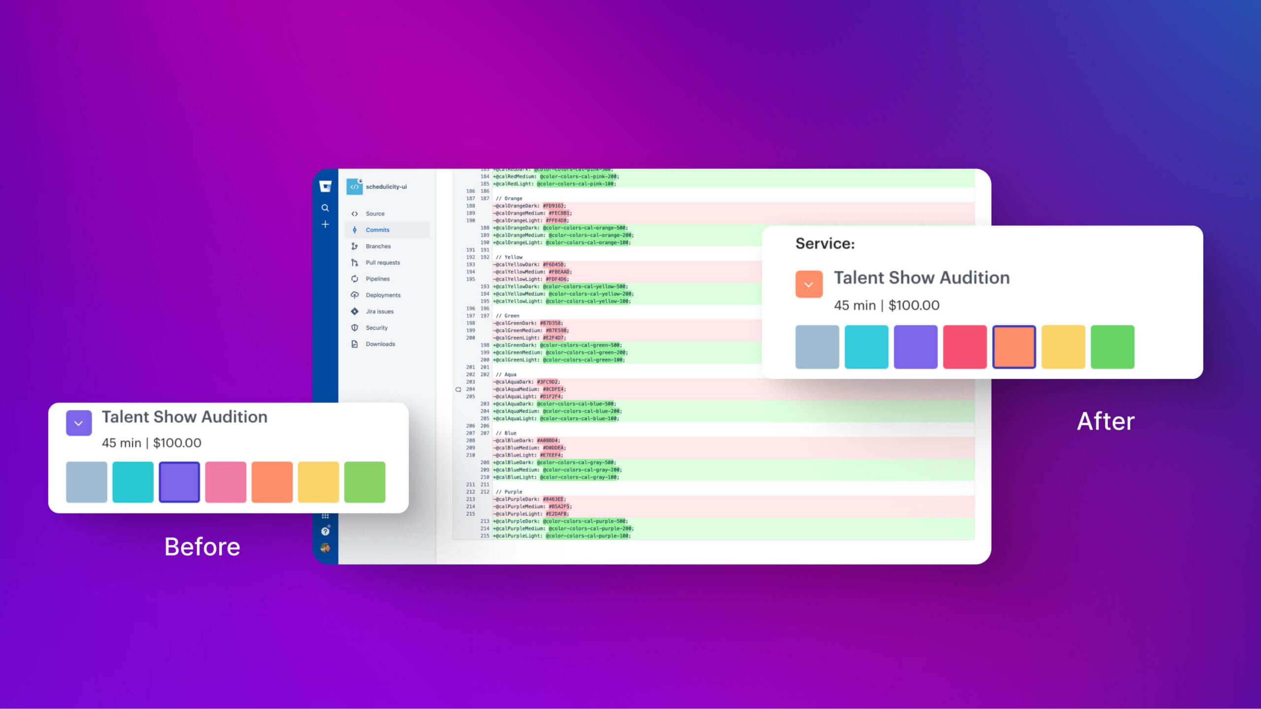
Calendar tokens defined to support new interface patterns
Results
The design system established a shared foundation that improved consistency across design and development while supporting the company’s technical modernization efforts.
Results included:
- Created Schedulicity’s first centralized design system.
- Improved consistency between design and implementation through a shared design token structure.
- Reduced implementation questions by providing standardized documentation and reusable components.
- Improved accessibility through semantic color tokens and WCAG-compliant color palettes.
- Reduced component duplication and simplified maintenance across the design system.
- Supported the migration to a unified Angular codebase with consistent design foundations.
- Established governance and documentation that enabled the design system to continue evolving over time.
Buttons were originally structured as separate components for each type. I refactored them into a single, tokenized base component using variant properties like type, state, and icon presence—improving scalability and aligning with dev implementation
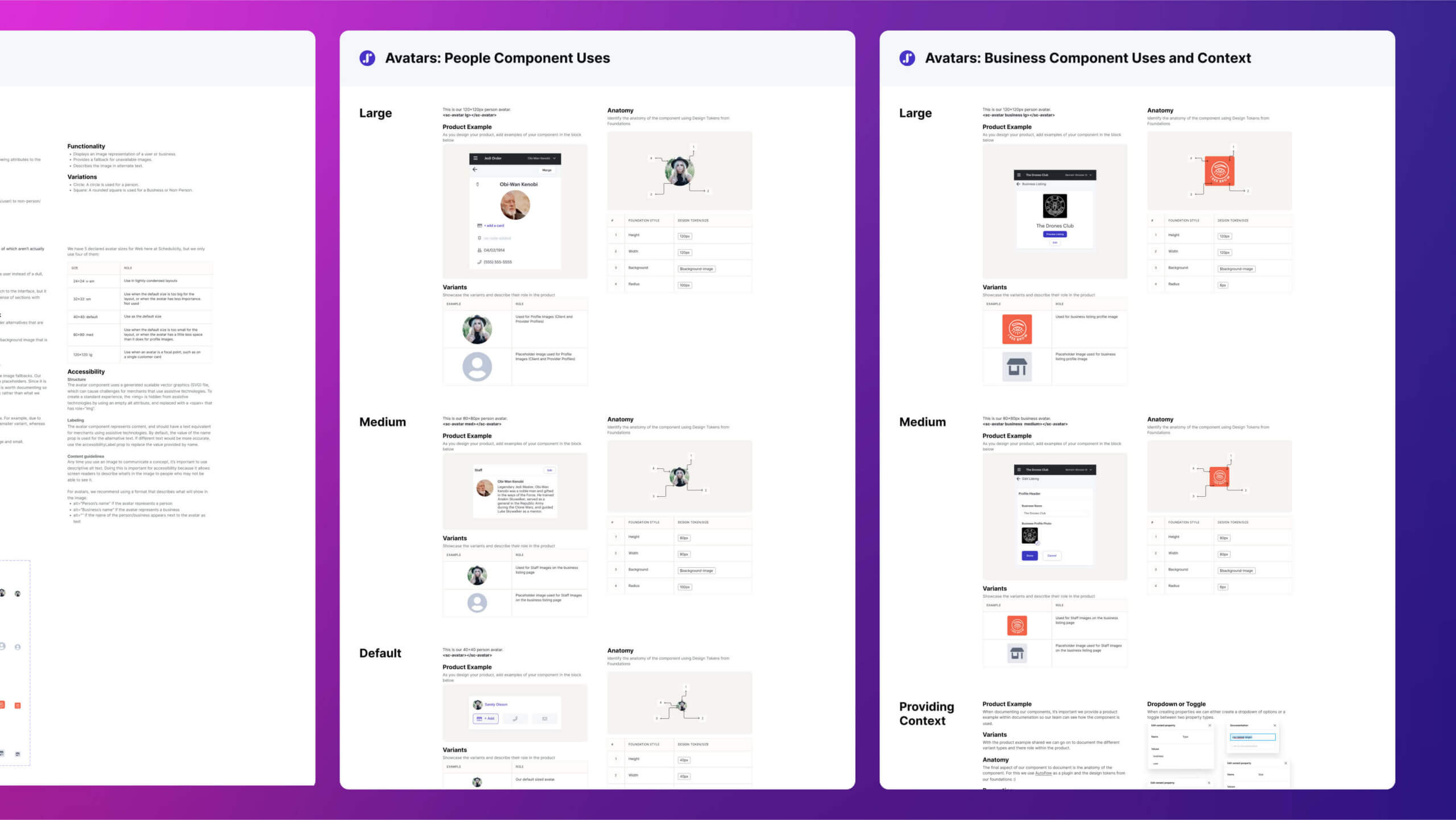
Documenting product examples, size variations, anatomy, and context ensures components are understood, used correctly, and adapted consistently across real-world scenarios
Reflection
What I Learned
Creating Schedulicity’s first design system reinforced that successful systems are built through collaboration, documentation, and shared understanding as much as through components and visual design. A design system succeeds when it helps teams make better decisions together.
That experience reinforced several principles:
- Strong design foundations make products easier to scale and maintain.
- Documentation is just as important as the components themselves.
- Design tokens create a shared language between designers and engineers.
- Governance helps maintain consistency as teams and products evolve.
- Collaboration is more important than tooling.
If I Had More Time
Given additional time, I would have expanded the design system by:
- Automating more of the design token workflow.
- Extending the system across additional internal products.
- Improving release management and documentation workflows.
- Continuing to strengthen collaboration between design and engineering.
Building Schedulicity’s first design system strengthened my interest in creating scalable systems that improve both product quality and the way teams work together. It demonstrated that thoughtful design foundations, strong documentation, and close collaboration can create lasting value well beyond individual features.