Outcomes at a Glance
- Increased time on site due to user-centered content and structure
- Reduced bounce rates through intuitive navigation and simplified messaging
- Higher conversion rates from clearer value communication and real product visuals
- Improved brand perception with modern, cohesive design and authentic UI imagery
- Scalable foundation established through modular layout and consistent visual language
Project Overview
Plex is an entertainment platform that helps users stream, organize, and access their personal and on-demand media across devices. As the product evolved, our marketing website struggled to keep up. The structure was app-centric rather than user-centric, content was fragmented, and visuals didn’t accurately reflect the product. By 2018, it was clear we needed a redesign that clarified our value, improved engagement, and modernized the visual experience to match the sophistication of the platform.
The redesign aimed to:
- Communicate Plex’s value clearly
- Improve engagement and reduce bounce rates through improved navigation
- Replace stock imagery with real product visuals
- Align the site with a consistent, scalable brand experience
Problem Statement
The existing marketing site made it difficult for users to understand Plex’s value. Its navigation was structured around the product’s internal app architecture, not how users actually used it. Stock photography created a disconnect between the product and the user experience, and inconsistent messaging led to confusion. These issues contributed to higher bounce rates, lower conversions, and a missed opportunity to connect with new users.
We needed to realign the site around user goals, streamline content, and better reflect Plex’s product in both visuals and language.
My Role
I worked as both a UX and Visual Designer during this redesign. My focus was on creating a clearer, more compelling user experience while supporting broader marketing efforts throughout the 4.0 site build. My responsibilities included:
- Concepting and designing the homepage and key feature pages
- Refining content hierarchy and messaging for clarity
- Collaborating with product and marketing to maintain alignment across all touchpoints
- Working alongside two other designers, a Communications and Localization Manager, a Marketing Manager, and a Web Developer
- Engaging with the VP of Marketing, CPO, and CEO as key stakeholders
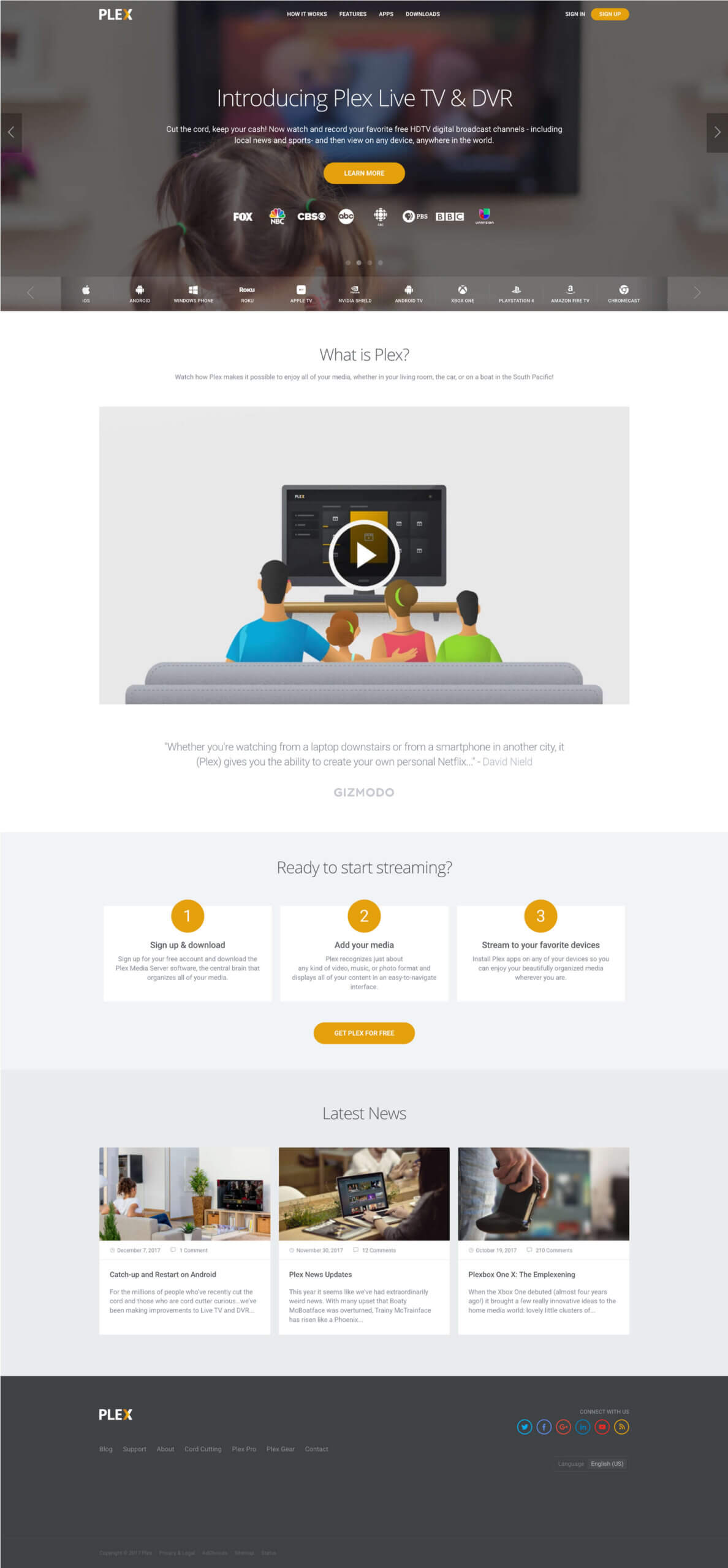
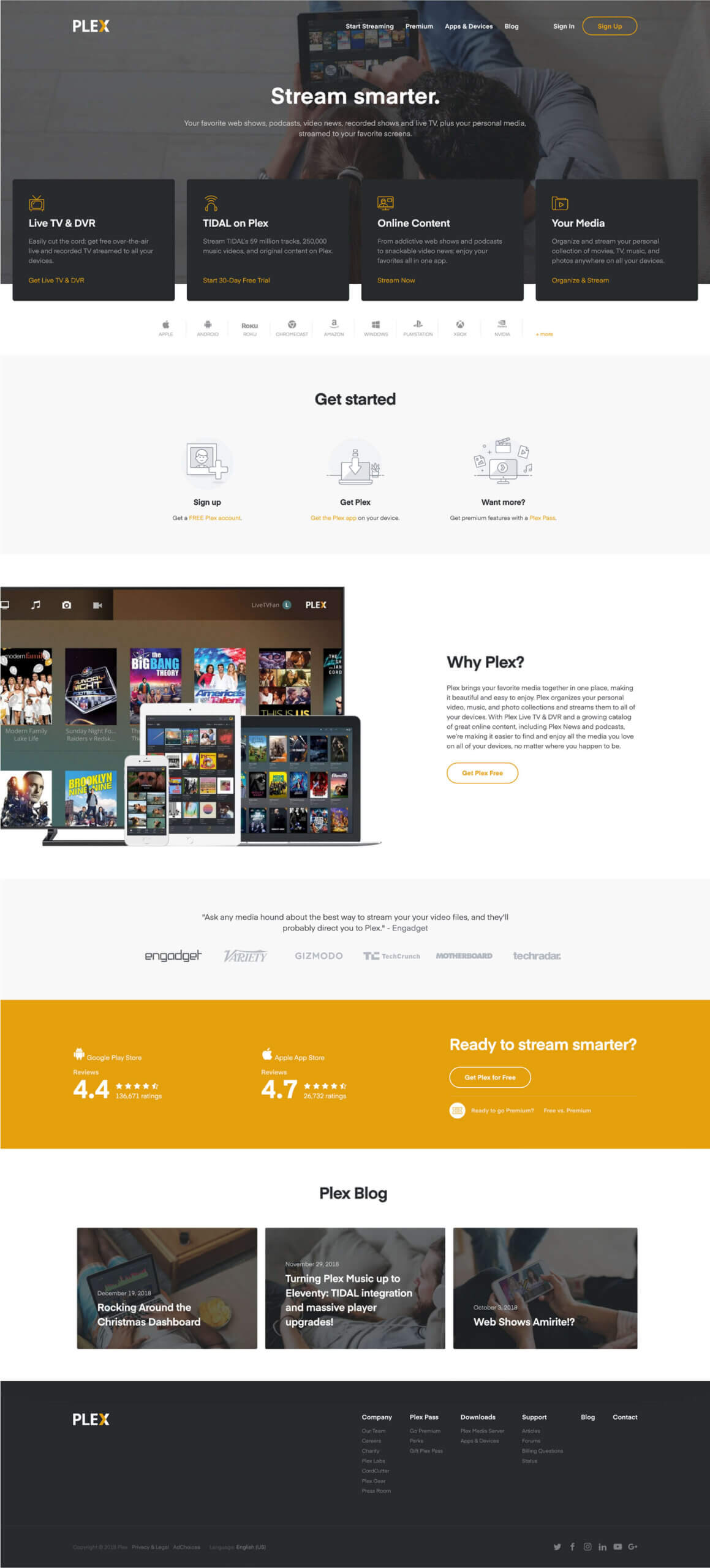
Plex’s Homepage Before the Redesign
Research & Discovery
We grounded the redesign in real feedback and behavior. Our research methods included:
- User surveys and feedback to identify frustrations with the old site
- Behavioral analytics to see how users navigated the experience and where they dropped off
- Competitive analysis to understand how other media platforms structured their content
From this, we learned:
- Many users didn’t fully understand what Plex does
- Navigation was unintuitive, which made exploring features difficult
- Product visuals were either missing or not representative of the true experience
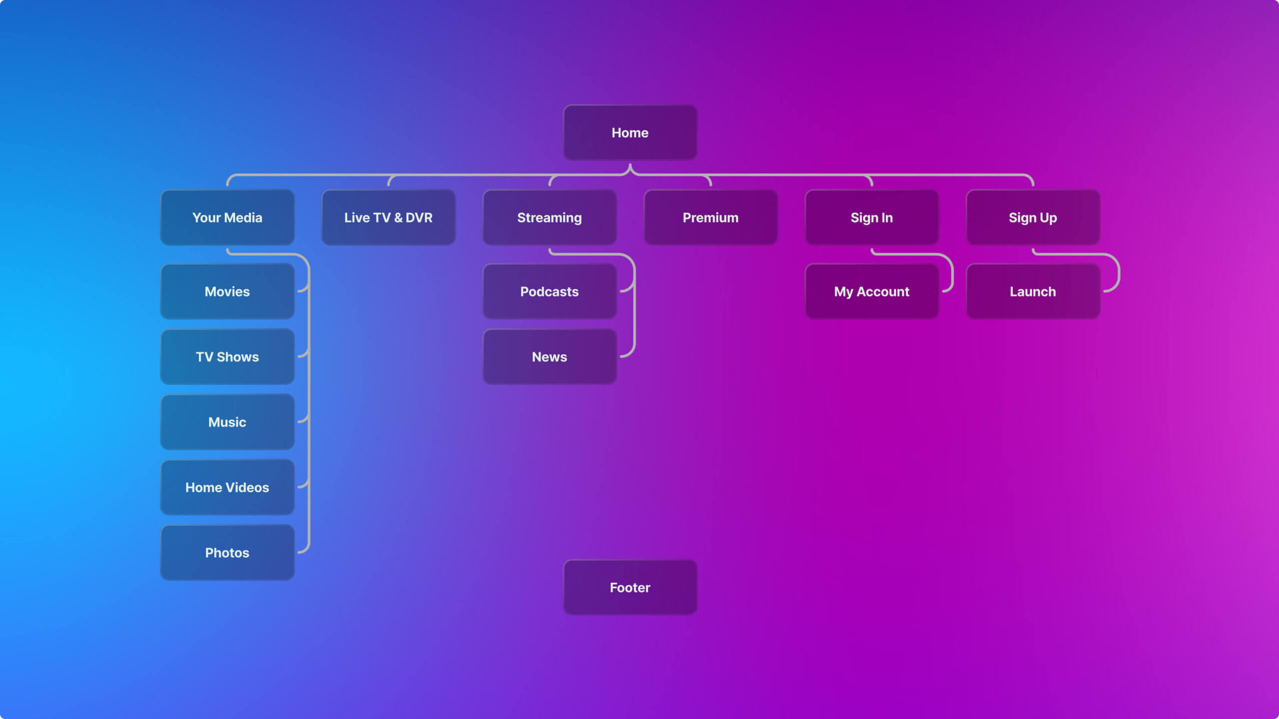
Sitemap of the New Site
Ideation & Validation
Each of the three designers on our team—myself included—developed a unique concept for the redesign, each focusing on different user and business goals:
- A narrative-focused flow that walked users through Plex’s features step-by-step
- A visual-first layout showcasing product UI in real-world use
- A modular layout designed for future scalability and content flexibility
We presented the concepts to internal stakeholders and gathered feedback through user testing. The final direction was a hybrid approach that combined the strongest aspects of all three: clear storytelling, modular scalability, and authentic product visuals.
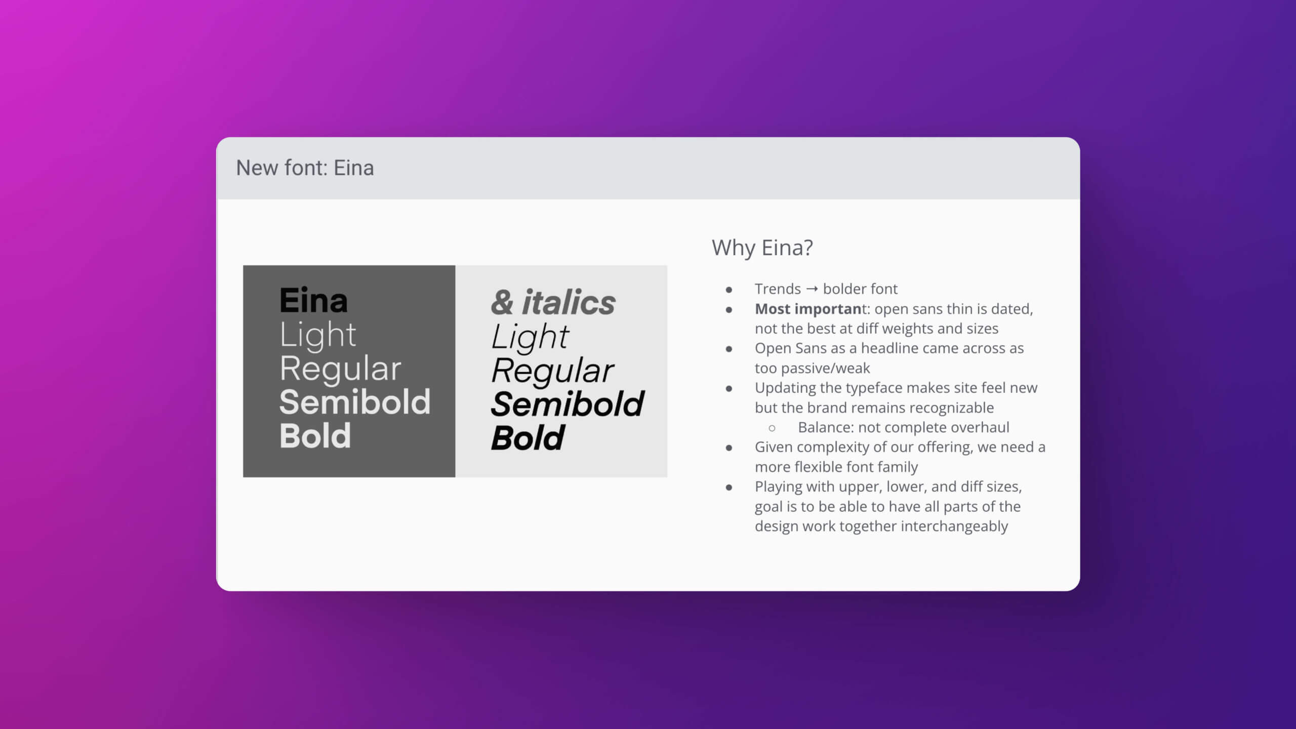
Updating Our Typeface from Open Sans to Eina
Initial Concepts
Design & Implementation
The updated site focused on clarity, connection, and consistency. Key improvements included:
- Use-case-driven structure – content was organized around real-world media use, making it easier for users to understand how Plex fit into their lives
- Authentic product visuals – stock photos were replaced with screenshots of the actual interface
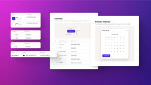
- Unified design system – a consistent style guide was applied to ensure brand cohesion
- Simplified messaging – jargon was removed to focus on clearly explaining benefits across all pages
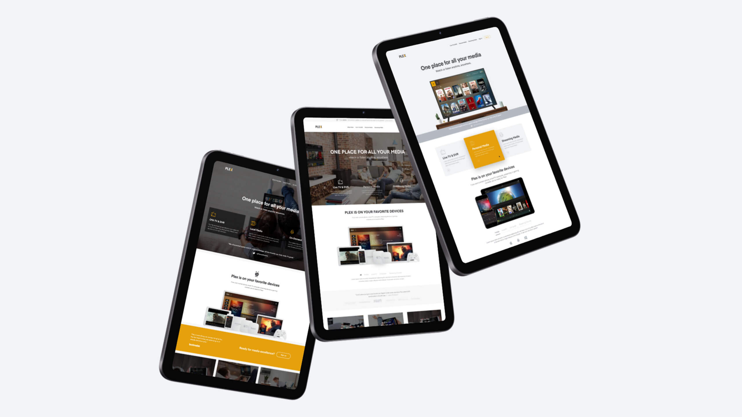
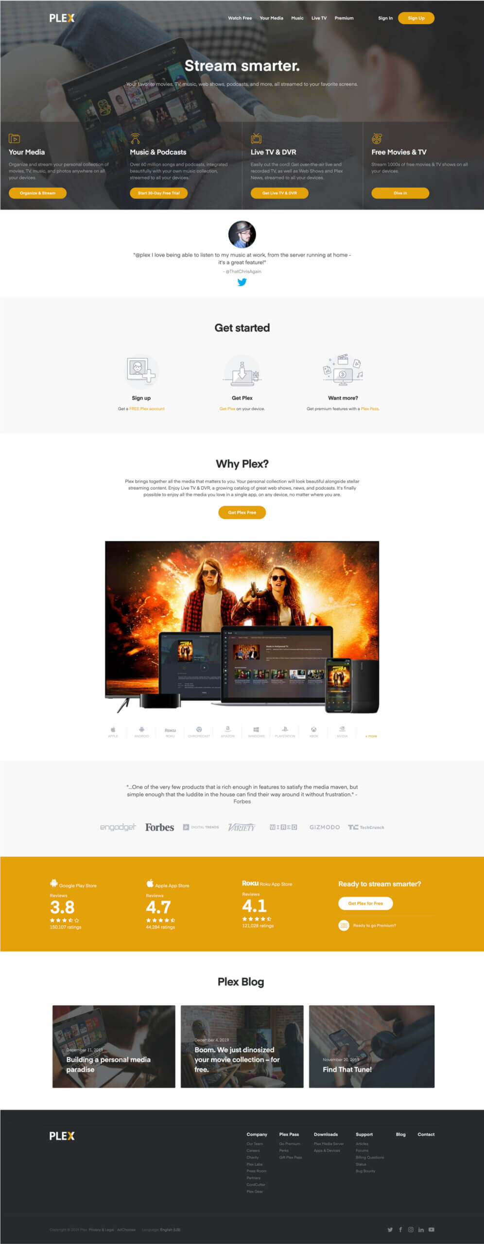
Our New Homepage Focusing on Clarity, Connection, and Consistency
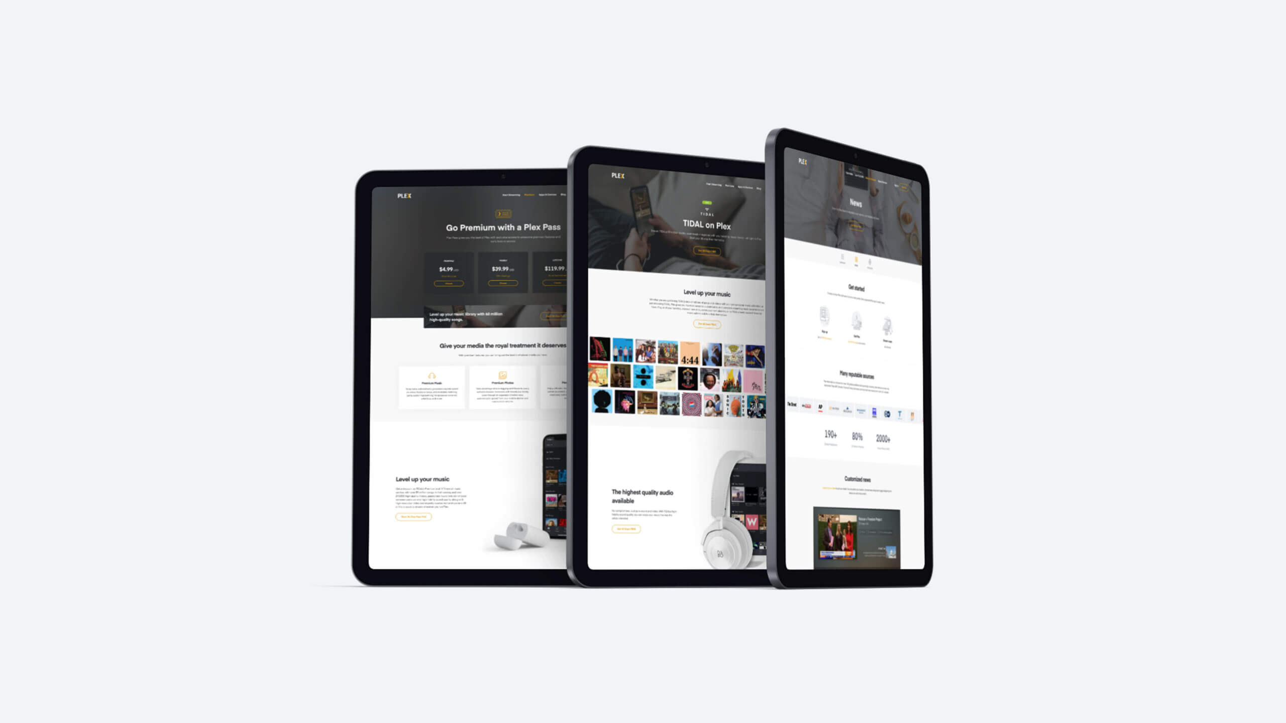
Supporting Pages: Plex Pass, TIDAL, and Live TV & DVR
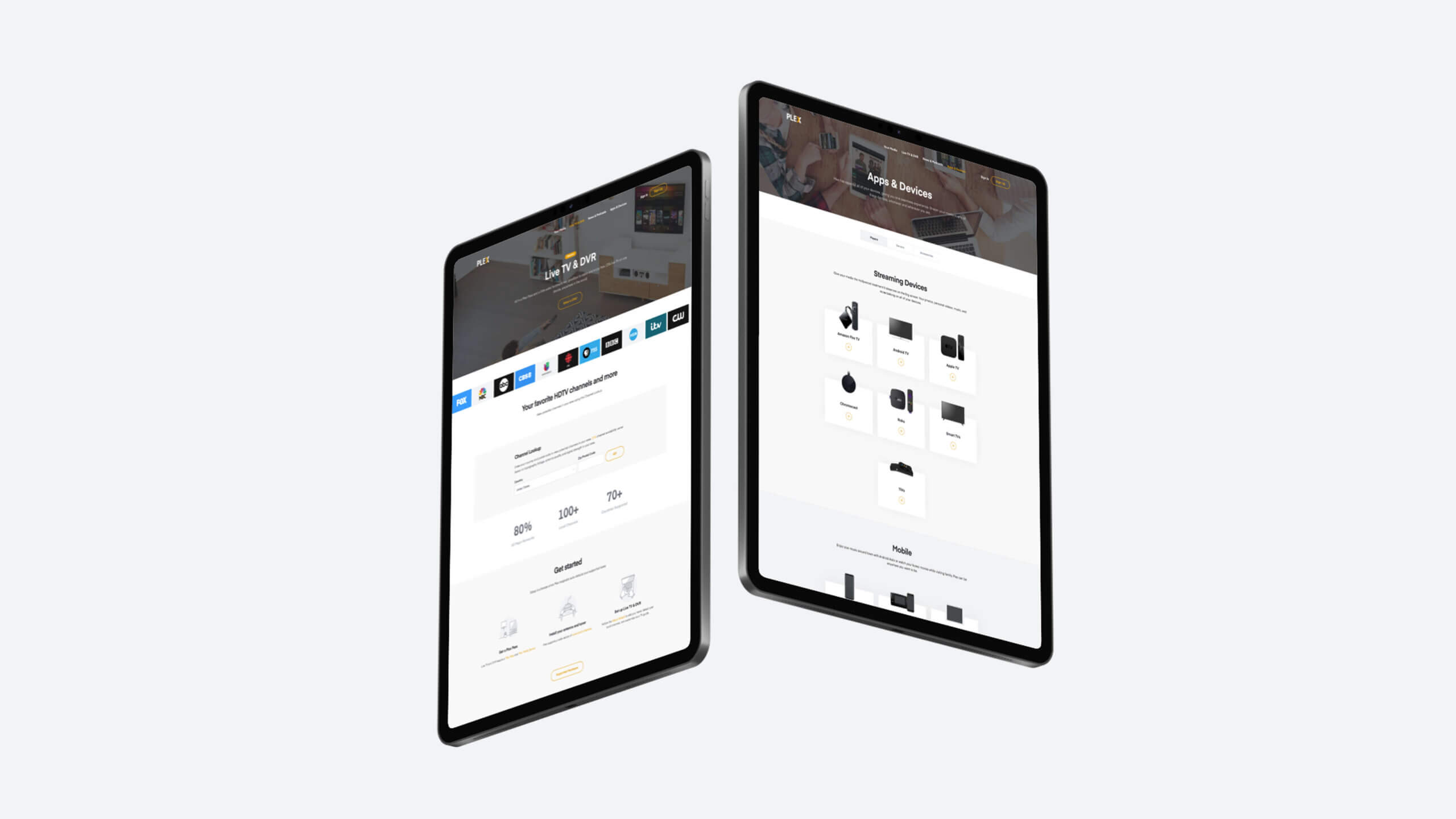
Supporting Pages: News, Apps & Devices
Tools & Technology
To bring the redesign to life, we used a reliable and flexible set of tools across design, development, and deployment:
- Adobe XD – Used to design page layouts, visual hierarchies, and interaction flows
- WordPress + WP Engine – The marketing site was powered by WordPress and hosted on WP Engine for scalability and performance
- Custom Theme Development – The theme was built from scratch using HTML, CSS, JavaScript, and PHP to give us full control over layout and functionality
- GitHub – Used for version control and collaboration across the team
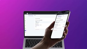
2019 Update Featuring New Navigation
Results & Impact
- Increased engagement – users spent more time on-site
- Improved navigation – reduced bounce rates and clearer user pathways
- Higher conversion rates – more users signed up or explored the product
- Stronger brand presence – Plex was positioned as a modern, innovative platform
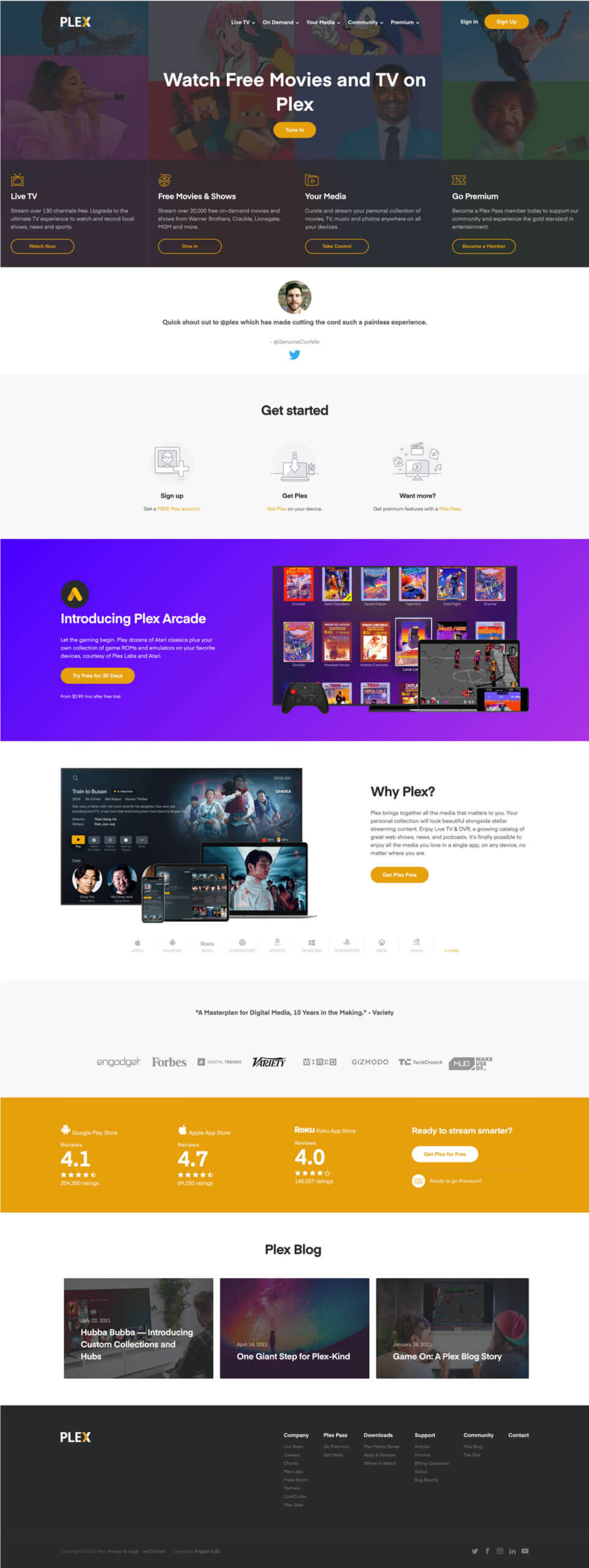
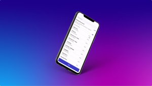
2021 Homepage Update featuring Live TV and a New Navigation
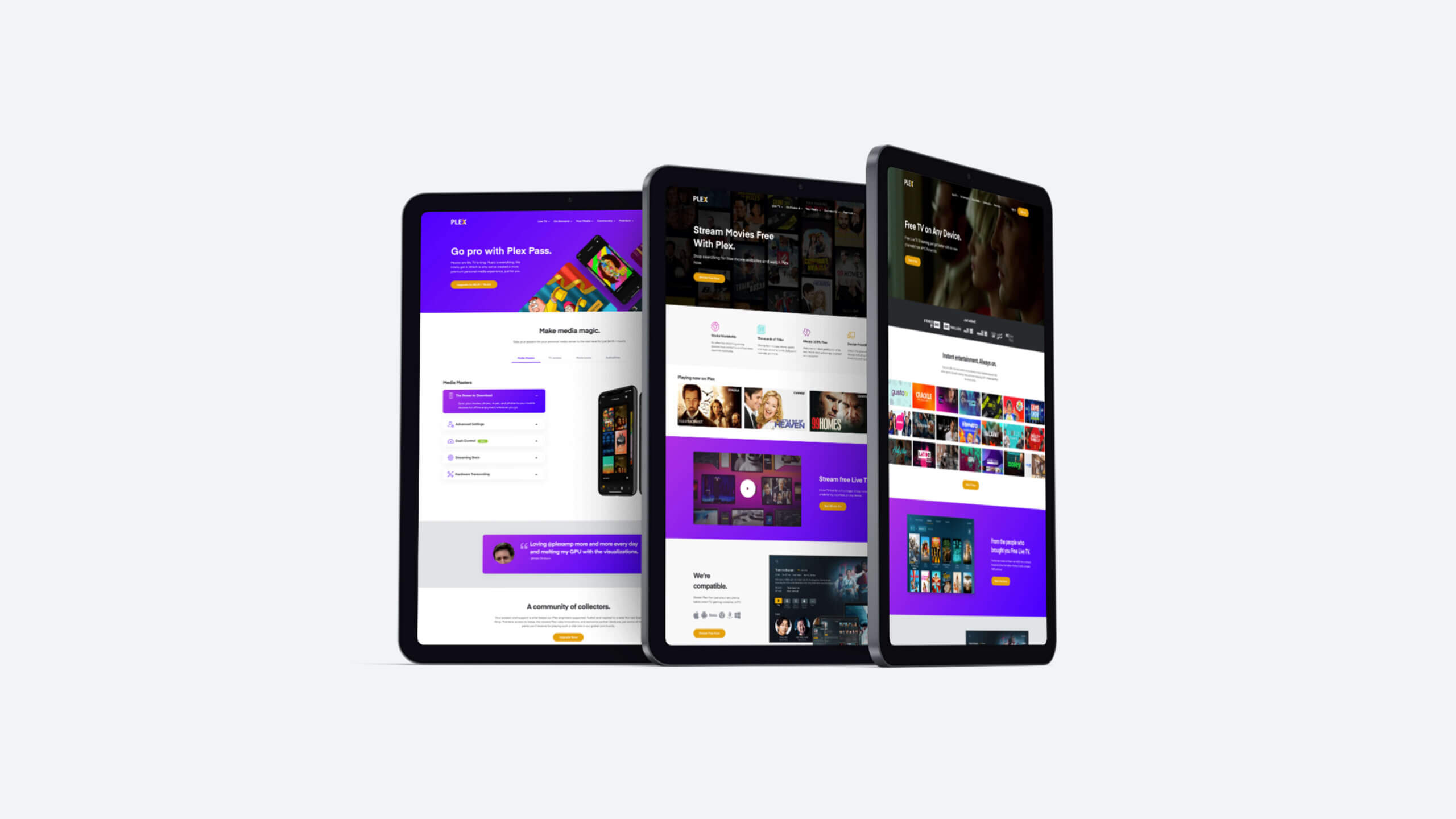
Supporting Pages for the 2021 Update: Go Pro with Plex Pass, Stream Free Movies, Free TV on Any Device
Final Thoughts
This was a foundational redesign rooted in research, thoughtful design, and clear communication. By shifting from an app-first to a user-first approach, we built a marketing site that helped users better understand Plex, made it easier to take action, and created a more scalable path for growth.