Executive Summary
Bumble and bumble’s digital presence had been split between two outdated platforms: one for consumers and one for salon professionals. This setup created inefficiencies for internal teams and a frustrating experience for users. As my final project with the company, I partnered with a Digital Design Director, an Associate Creative Director, designers, and freelancers to shape the foundational UX strategy. My role included auditing legacy platforms, creating a scalable information architecture, and turning research insights into clear direction for design.
The redesign unified the two platforms and modernized the brand’s digital capabilities. It introduced responsive design for modern devices, a centralized Drupal CMS to make updates easier, and a refreshed style guide for consistency. It also laid the groundwork for Bumble and bumble’s first design system, establishing consistent components, typography, spacing, and iconography across pages and audiences. Editorial and commerce came together through blogs, lookbooks, shoppable user-generated content, and updated product photography. These changes gave the brand new ways to inspire consumers while making the professional experience more efficient and reliable.
Outcomes at a Glance
- 15% increase in sales within months of launch
- 2× increase in sitewide engagement
- Mobile-friendly wholesale ordering quickly adopted by salon professionals
- Centralized Drupal CMS reduced duplication and streamlined workflows
- Unified brand identity across consumer and professional audiences
My Role
As a Senior UX Designer, I focused on the foundational work that set direction for the redesign. I audited the legacy ColdFusion and PERL platforms to surface constraints, defined a scalable information architecture for both consumer and professional journeys, and shaped the research approach to bring stakeholder and salon professional insights into the process. I also created early design artifacts that helped leadership make decisions and facilitated workshops to align priorities across teams. In collaboration with the Digital Design Director and Associate Design Director, I contributed to the first iteration of Bumble and bumble’s design system by introducing consistent components, typography, spacing, and iconography that established a foundation for cohesive and scalable digital experiences.
The Challenge
The company was maintaining two separate ecommerce platforms that duplicated work and confused users. Both were built on outdated technology that performed poorly on mobile and made ordering cumbersome. The consumer site even ran a separate mobile version, while the wholesale site had no mobile support at all. Business owners typically placed orders on desktop, but more salon owners and stylists were beginning to use their phones. The lack of mobile parity created frustration, abandonment, and missed opportunities. The overall brand experience felt inconsistent and outdated across platforms.
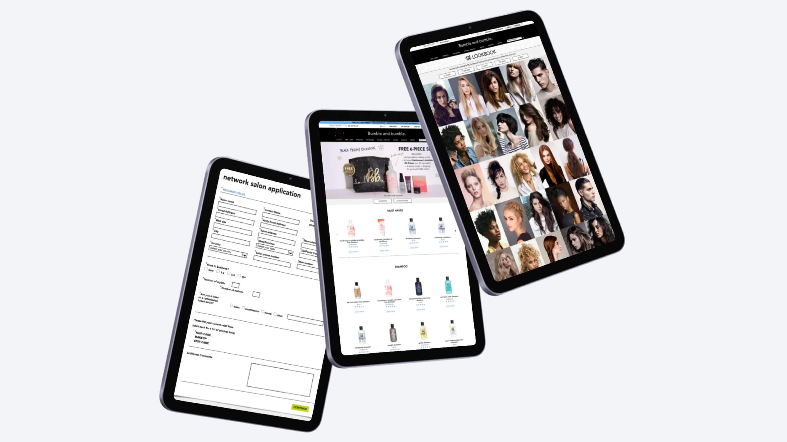
Before: Screens from the legacy consumer site showing the original professional sign-up flow, a multi-product landing page with outdated photography, and lookbook content.
UX Research
To uncover where the redesign would have the greatest impact, I collaborated with stakeholders, designers, and salon professionals. My focus was on shaping the right questions, identifying gaps, and turning insights into clear direction for design and strategy. Analytics revealed which sections of the consumer and wholesale sites were most used. I paired this with card-sorting exercises to validate how users naturally grouped information, giving us a data-backed foundation for the new IA. Conversations with salon professionals highlighted that wholesale ordering was the make-or-break experience. Their feedback, along with high mobile abandonment rates, reframed the project as a mobile-first redesign.
The original sitemap of the wholesale (network) site, showing a fragmented structure with duplicated sections and buried tools.
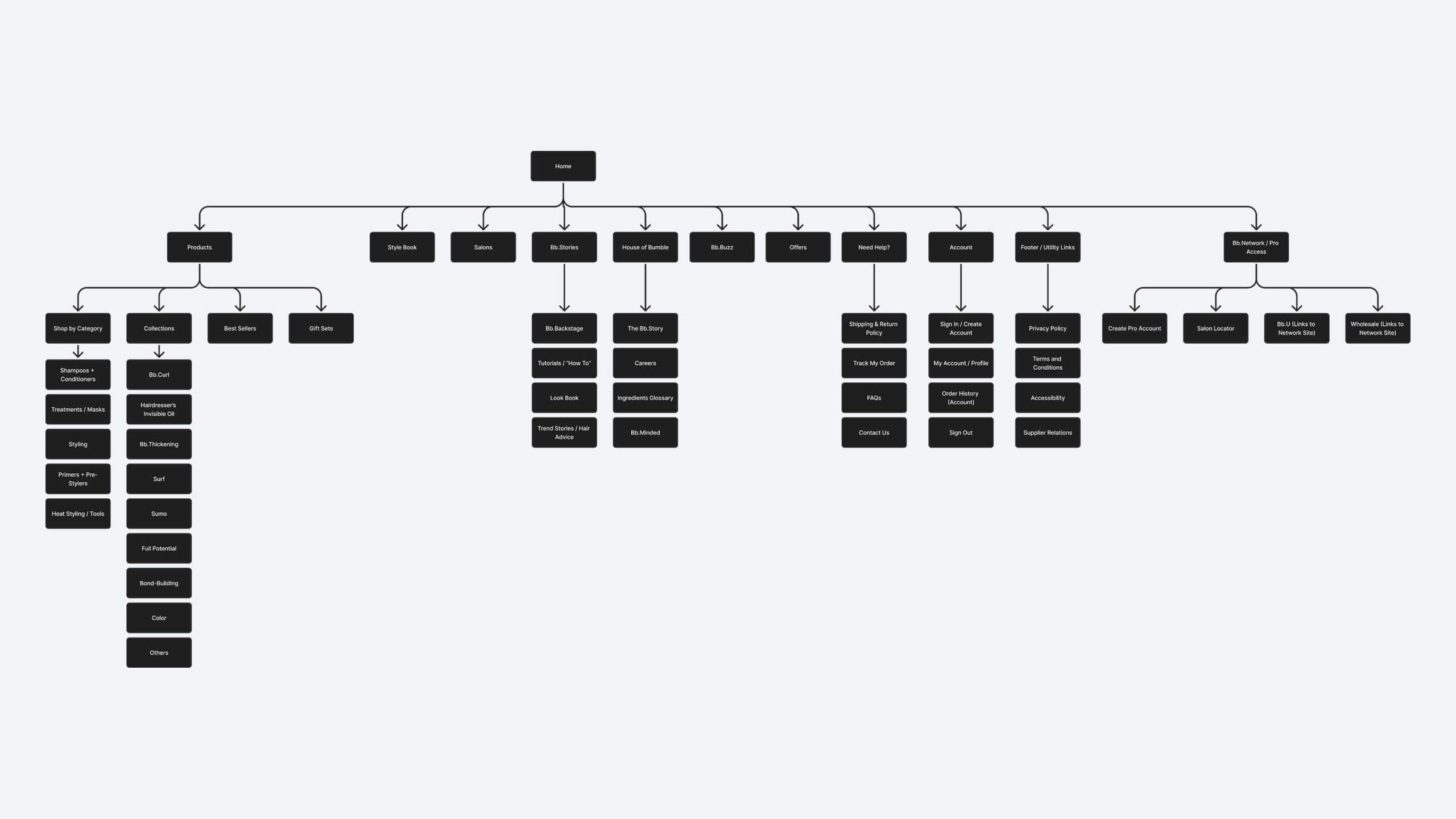
The old consumer site’s sitemap, which relied on a separate mobile site and created a fractured customer journey.
UX Strategy
With research insights in place, our team agreed on a clear goal: build a single platform powered by a centralized Drupal CMS. This reduced duplication for internal teams and created consistent experiences for users. My role was to shape how the new information architecture and content strategy supported this direction, while the design directors focused on brand and creative priorities. Together we defined success around three goals: increase conversion, reduce friction in wholesale ordering, and strengthen the brand’s identity across audiences.
The strategy also modernized how the brand expressed itself digitally. Beyond improving core commerce flows, the redesign introduced responsive templates, integrated editorial and product content, and added features like interactive style guides, lookbooks, and shoppable UGC. I helped ensure the new IA and content structure could support these features in a scalable way for both consumer and professional journeys.
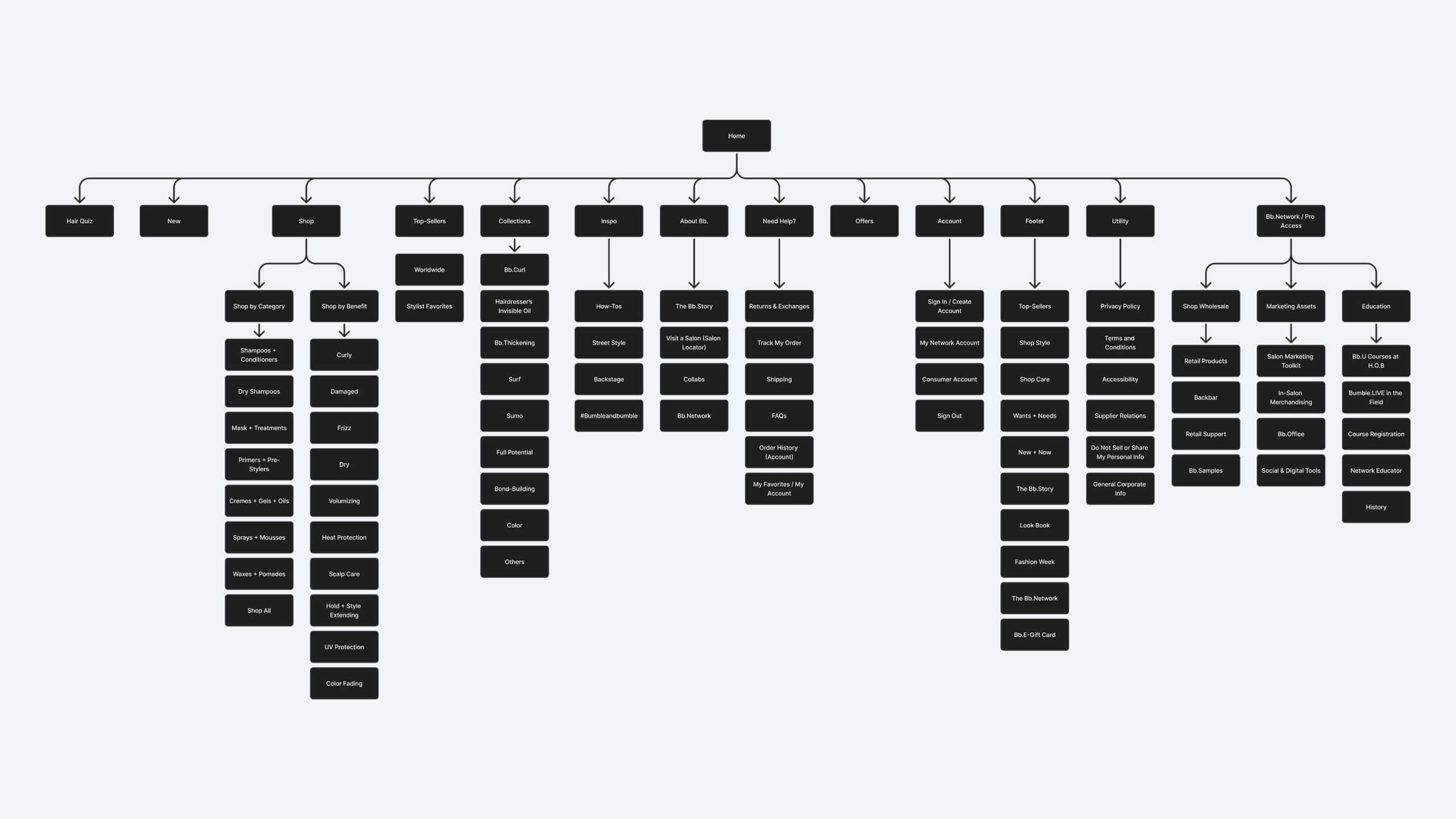
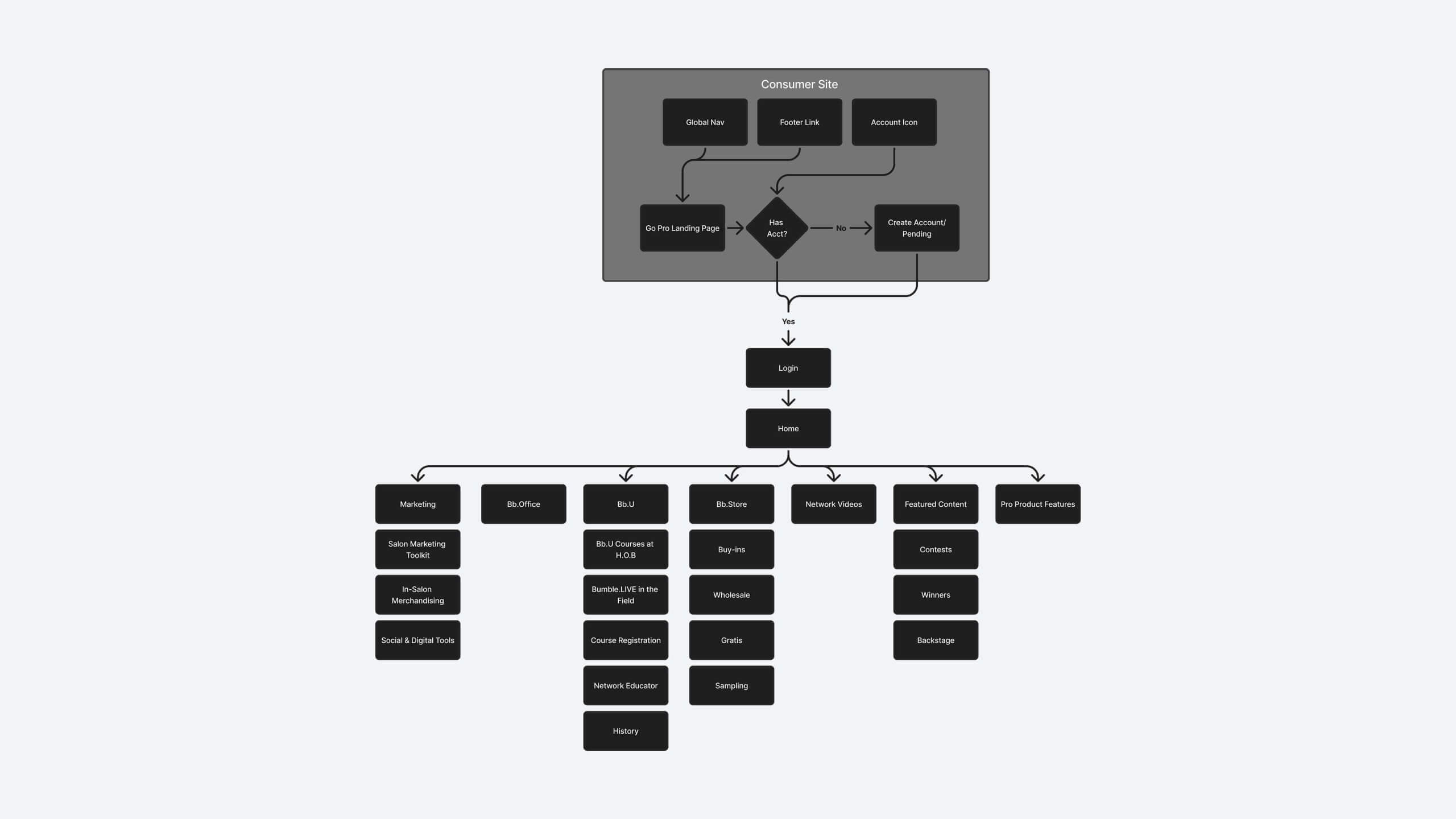
The redesigned consumer sitemap, which unified professional and consumer journeys, reduced duplication, and established a scalable framework.
Design in Action
Using the new IA as a foundation, I created early artifacts that helped the team and leadership weigh tradeoffs and make informed decisions. These wireframes and prototypes acted as alignment tools, helping leadership make decisions that had stalled for years. Once the direction was set, our design team, guided by the Digital Design Director and Associate Design Director, extended the framework across critical flows: the homepage, product pages, checkout, and wholesale ordering. The homepage adapted to different audiences. Product pages unified SKUs while adjusting pricing and checkout paths based on account type. Bulk restocking was rebuilt to be mobile-friendly and intuitive. Content and education were integrated into commerce to inspire and guide shoppers.
I focused on ensuring the IA and research insights translated into usable structures, while the broader team carried that through to high-fidelity design and launch. This collaboration bridged strategy with execution and kept both consumer and professional journeys consistent.
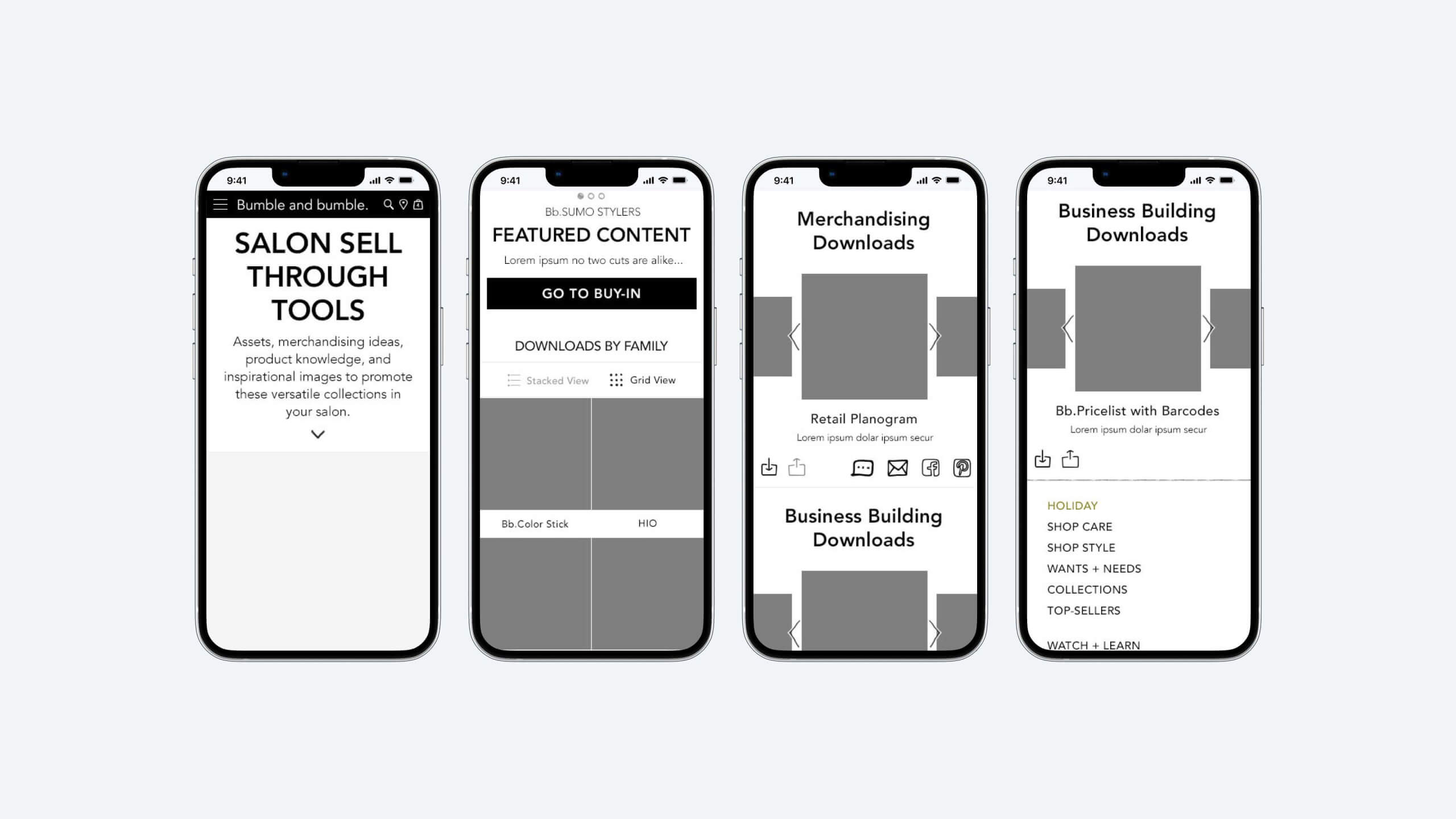
Wireframes for the redesigned wholesale tools section, reimagined for mobile to support stylists and salon owners placing orders on their phones.
Impact
Together, the team delivered measurable results. Sales increased by 15 percent within months of launch. Sitewide engagement doubled. Professionals quickly adopted mobile wholesale ordering, while internal teams benefited from centralized workflows in the new Drupal CMS. Most importantly, the brand presented a consistent identity that inspired confidence among users.
The redesign also expanded what the brand could do online. Responsive design finally supported mobile users. Editorial features like blogs and lookbooks connected inspiration directly to purchase. Shoppable UGC and updated product photography brought the brand to life in new ways. Building on the IA and content structures I helped establish, these upgrades gave consumers and professionals a modern, cohesive experience that balanced storytelling with commerce.
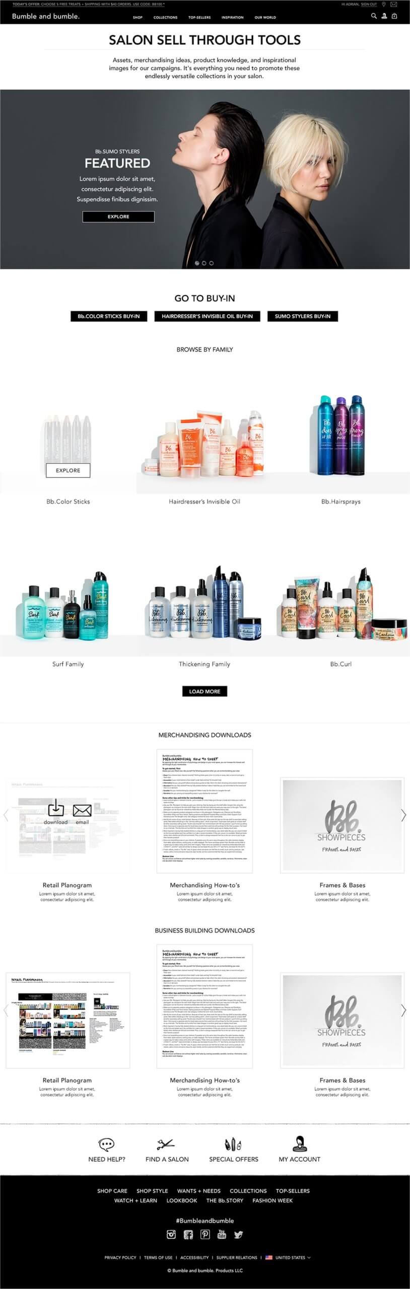
Screenshot of the redesigned wholesale site, featuring sell-through tools, merchandising downloads, product families, and buy-in flows.
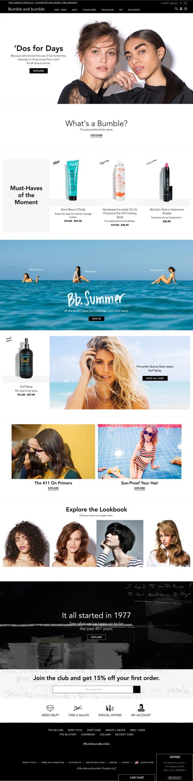
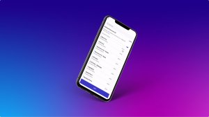
Screenshot of the new consumer homepage at launch, combining brand storytelling and commerce in a single mobile-first design.
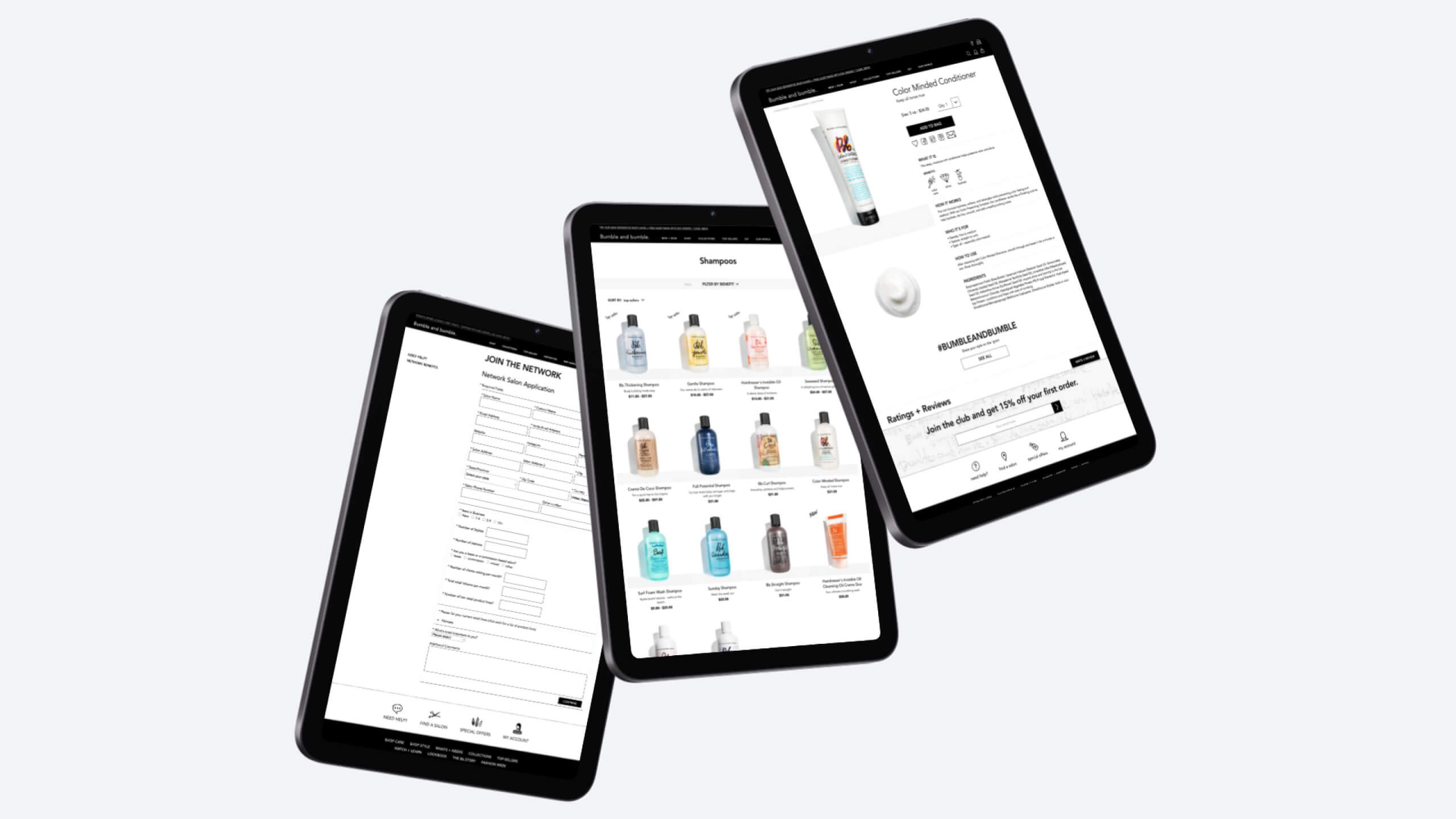
Finalized designs for the professional experience, including the new sign-up flow, multi-product landing page, and single product page.
Reflection
This project reminded me that real impact comes not just from producing artifacts but from creating clarity and alignment across teams. My contributions in IA, research framing, and early prototypes unlocked conversations that shifted leadership from debating creative details to focusing on strategy. The Digital Design Director and Associate Design Director ensured the brand and creative vision stayed strong, while the wider team translated foundations into execution. Including salon professionals early confirmed that wholesale ordering was the key adoption driver, and analytics reframed the importance of mobile as a critical factor for success.
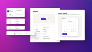
Another important takeaway was the value of systemizing design early. By establishing consistent components, typography, spacing, and iconography, we created Bumble and bumble’s first design system. It was small at first but powerful in setting a precedent for scalable, cohesive digital experiences. That experience reinforced for me how even a lightweight design system can align teams, reduce duplication, and strengthen brand identity.
Looking Ahead
If I had stayed with Bumble and bumble, I would have continued building on this momentum. My priorities would have been refining wholesale flows with ongoing feedback, improving checkout through analytics and A/B testing, and setting governance practices for the Drupal CMS to keep the platform consistent as it scaled.
I also saw a bigger opportunity in the salon professional sign-up flow. It was clunky and often abandoned, which created a barrier for professionals who needed access to pro pricing and education. I envisioned a faster, clearer, and more supportive experience. I would have started by auditing the current journey to find points of friction, then simplified the form to only the essentials at sign-up while moving secondary details to profile setup. Breaking the process into short, progressive steps would have made it easier to complete.
On mobile, usability would have been the main focus. Larger tap targets, inline validation, and clear error handling would have made the form more reliable. I would have added trust signals to explain why certain information was required and how it helped professionals. After sign-up, onboarding could have guided users to quick wins such as placing their first wholesale order, accessing tutorials, or customizing their profile.
These improvements would have lowered barriers, built trust, and set the tone for loyalty. Instead of being a frustrating task, sign-up could have become the start of a stronger relationship with the brand.