Executive Summary
I led the redesign of Schedulicity’s iOS Business App service editing workflow, a high-frequency task critical to appointment accuracy. Errors in this flow disrupted schedules, eroded client trust, and drove costly CX volume. Partnering with Product, Engineering, CX, and QA, I delivered a scalable interaction model that reduced support tickets by 40% and improved task success by 25%, directly improving efficiency, retention, and operational cost savings.
Outcomes at a Glance
- 40% reduction in service-editing related support tickets (per CX team)
- 25% improvement in task success during usability testing (baseline ~66.6% → 83.3%)
- Users completed edits faster, with fewer errors — boosting staff efficiency and protecting client trust
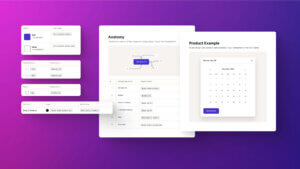
- Reusable pattern aligned with iOS standards and reduced future maintenance costs
- Cross-functional validation ensured the redesign addressed the root issue
Overview
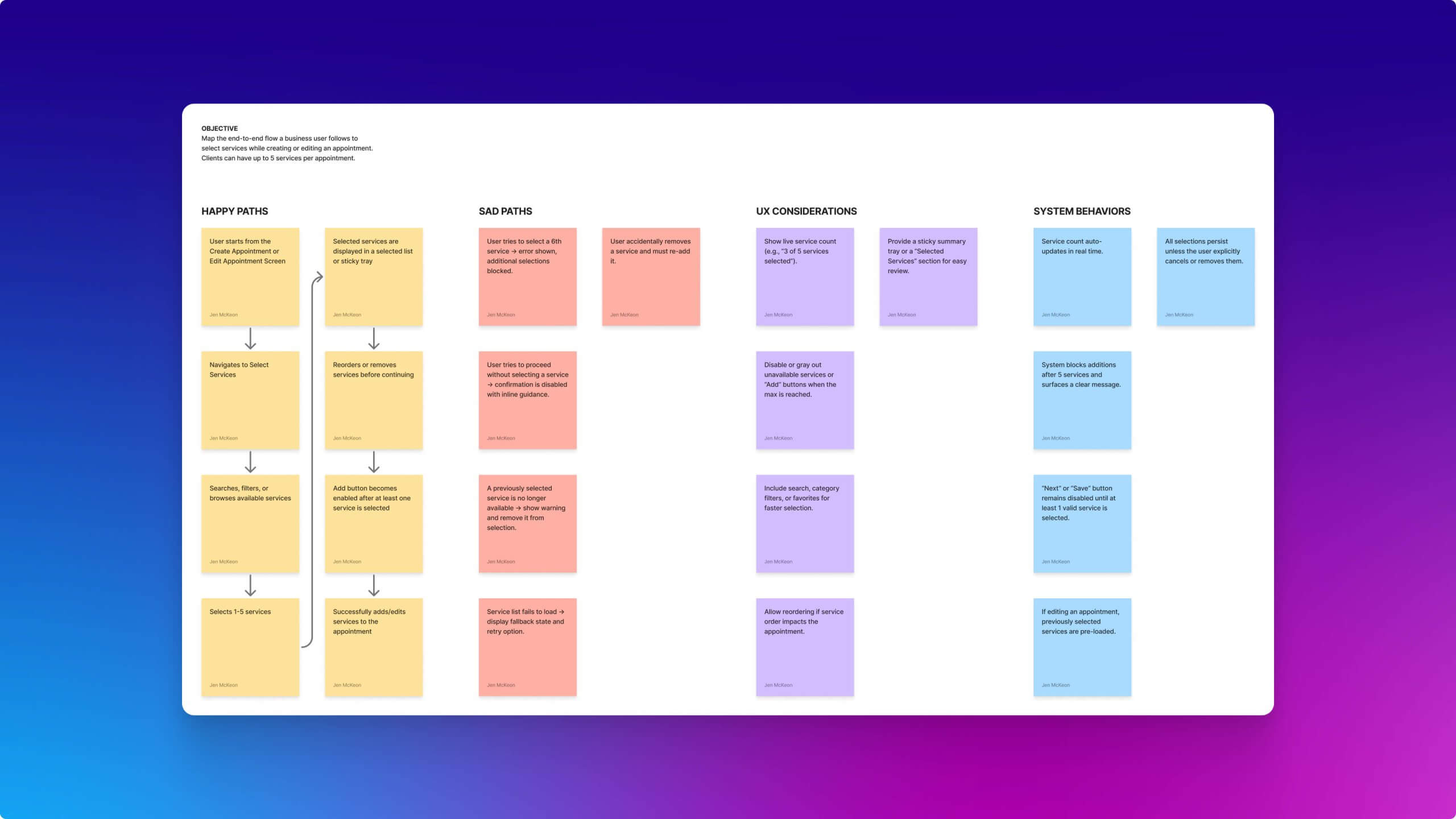
For appointment-driven businesses, accuracy directly impacts revenue. In Schedulicity’s iOS Business App, editing services within existing appointments was confusing, error-prone, and a frequent source of CX tickets. Each error carried real business cost: disrupted schedules, client frustration, and increased support overhead. A redesign was needed to reduce errors, protect client trust, and lower CX burden while aligning with platform standards.
My Role
As Product Designer, I owned the UX end-to-end. I synthesized CX and support data, ran interviews, designed and prototyped new interaction patterns, and validated them through usability testing. I partnered with the Product Owner on goals and prioritization, Engineering on feasibility, and QA on edge cases. Every design decision was evaluated against business outcomes: reducing CX load, improving efficiency, and preserving client trust.
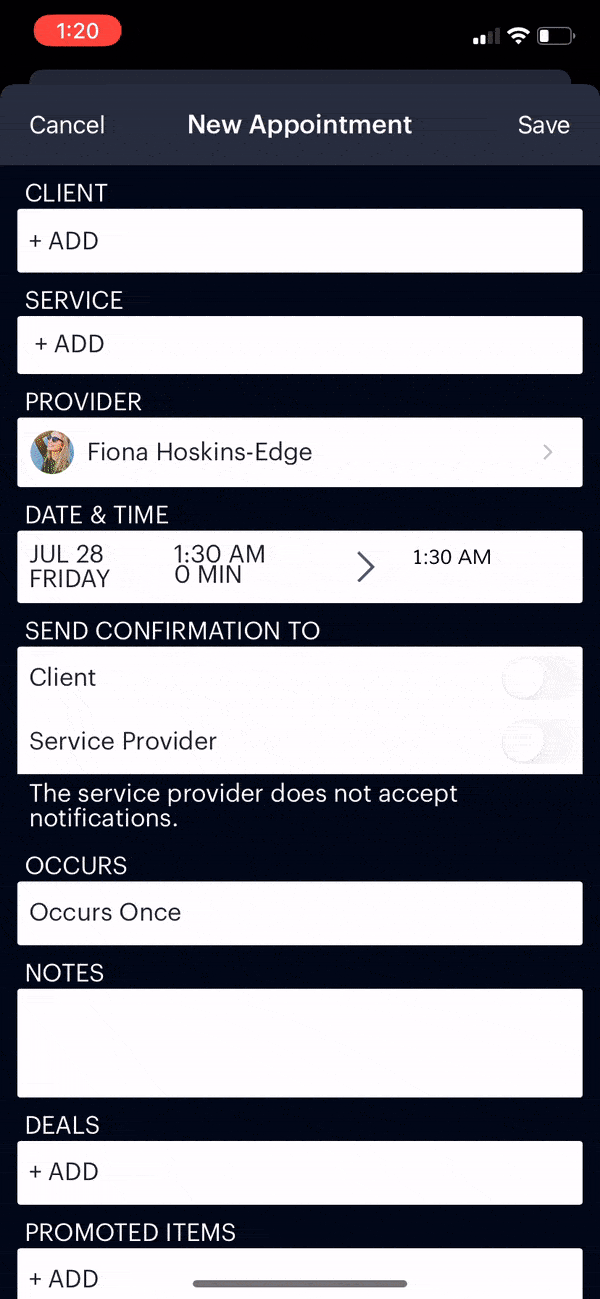
Before: confusing tap-to-remove model created duplicate errors, mistrust, and high CX volume.
The Problem
Editing services in existing appointments was unclear, resulting in frequent errors and higher support costs.
Root issues identified:
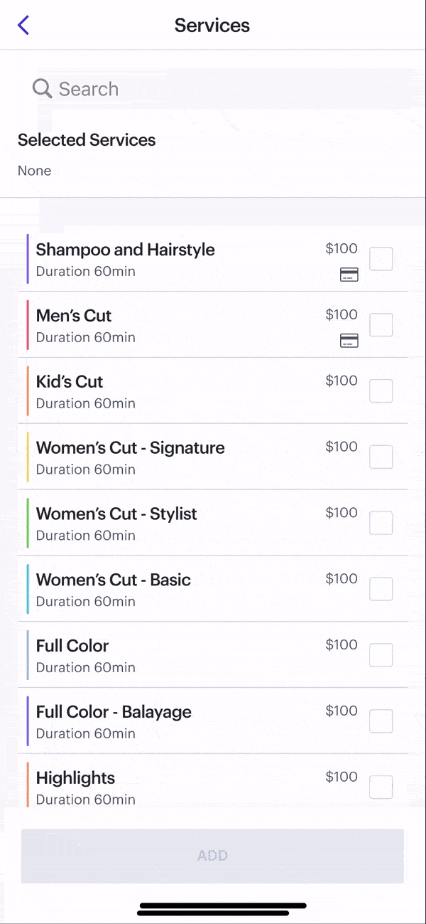
- Users didn’t realize they needed to tap the original service to remove it
- Long menus buried selections, leading to duplicates or wrong services
- No visual feedback made the workflow feel broken or unpredictable
“I thought I removed the old service, but it saved both.” – User, via CX ticket
Research & Discovery
I led a mixed-methods approach designed to link UX issues directly to business costs:
- CX ticket review: 13+ documented complaints tied to this workflow
- User interviews: Confirmed frustration and mistrust caused by errors
- Behavioral analysis: Identified repeated actions and inefficiencies leading to higher abandonment
Insight: The broken flow was driving higher CX volume, lost staff efficiency, and churn risk.
Key Insight
Users needed persistent, intuitive feedback and a way to manage services in long lists without breaking scroll or flow. Solving this would not only reduce errors but also cut CX costs and improve trust — directly impacting business outcomes.
Mapped the user flow to identify failure points where errors increased support costs and risked client trust.
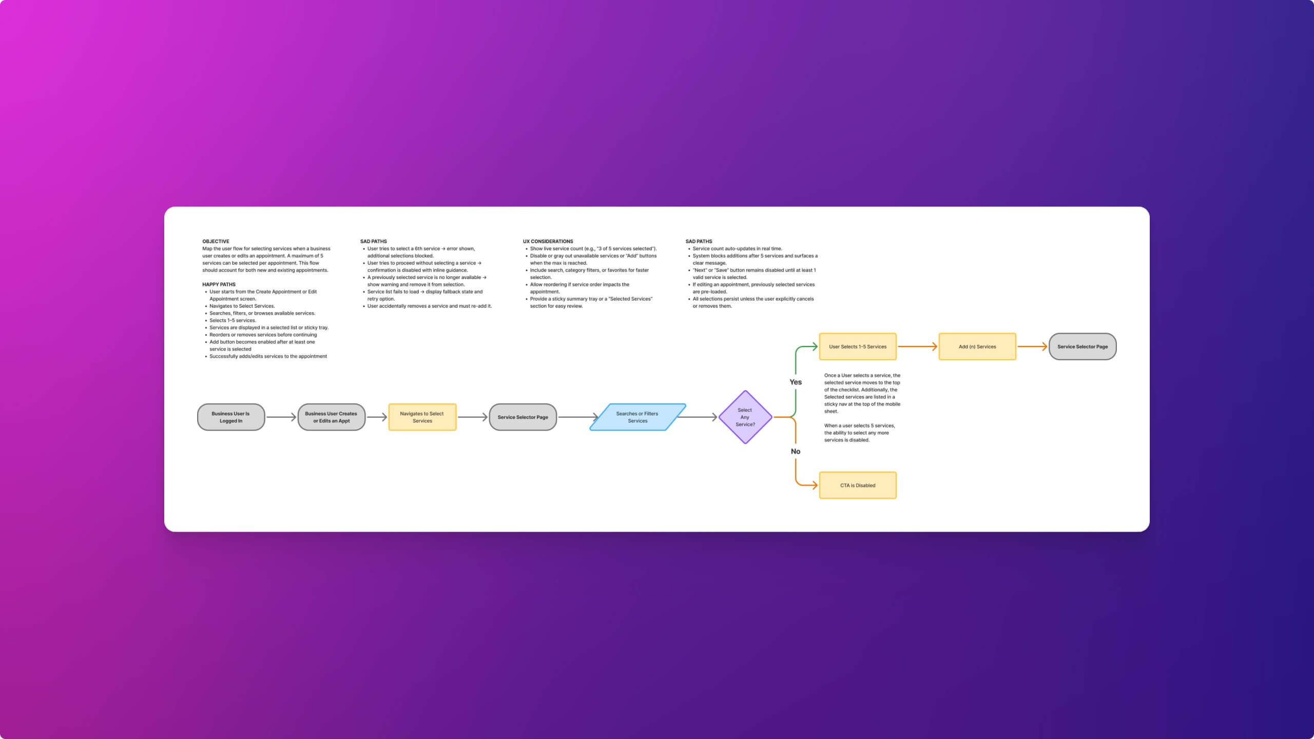
Redesigned flow emphasized clarity and predictability — reducing errors, increasing efficiency, and protecting revenue.
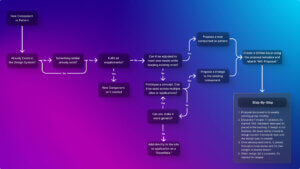
Process
I rapidly sketched, prototyped, and tested variations with business owners. Early validation surfaced which ideas solved the problem and which introduced new confusion, reducing rework and aligning the team on the right trade-offs.
Trade-offs & Decisions
We balanced clarity, efficiency, and scalability, with each decision tied to its business impact:
- Preserve scroll vs. auto-move: Preserving scroll reduced perceived errors, cutting CX tickets tied to “vanishing” selections.
- Checkmarks vs. tap-to-remove: Checkmarks increased UI density but improved predictability, lowering mistakes and saving staff time.
- Pinned Selected Services: Constant visibility reduced confirmation errors and boosted confidence in edits.
Early Concepts
We tested lightweight improvements (checkmarks, auto-move). Auto-move caused selections to “disappear” mid-scroll, which users perceived as errors. Preserving scroll fixed this, reducing future CX load and error rates.
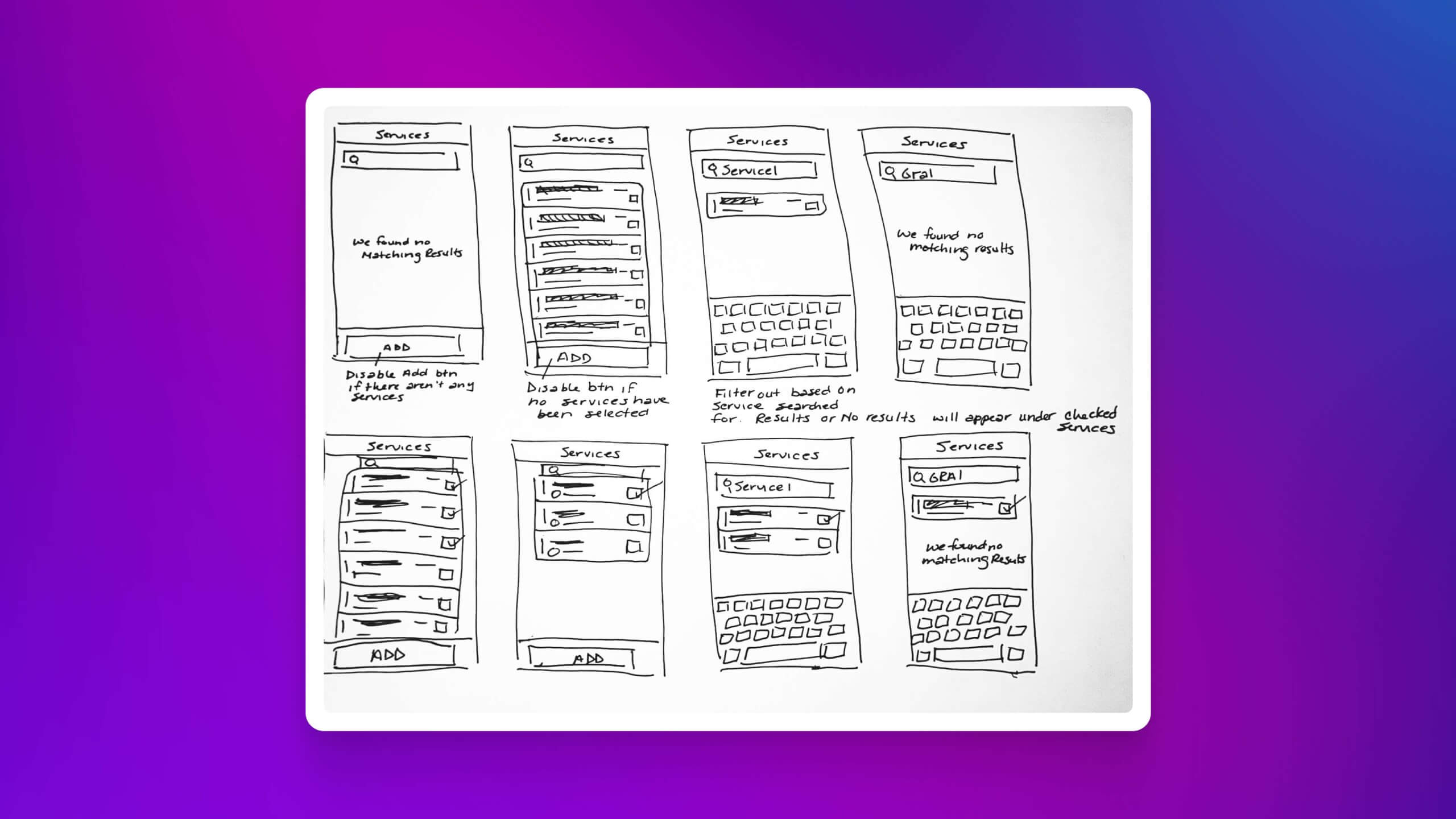
Wireframes tested selection behavior and interaction logic early, reducing costly rework and aligning with engineering feasibility.
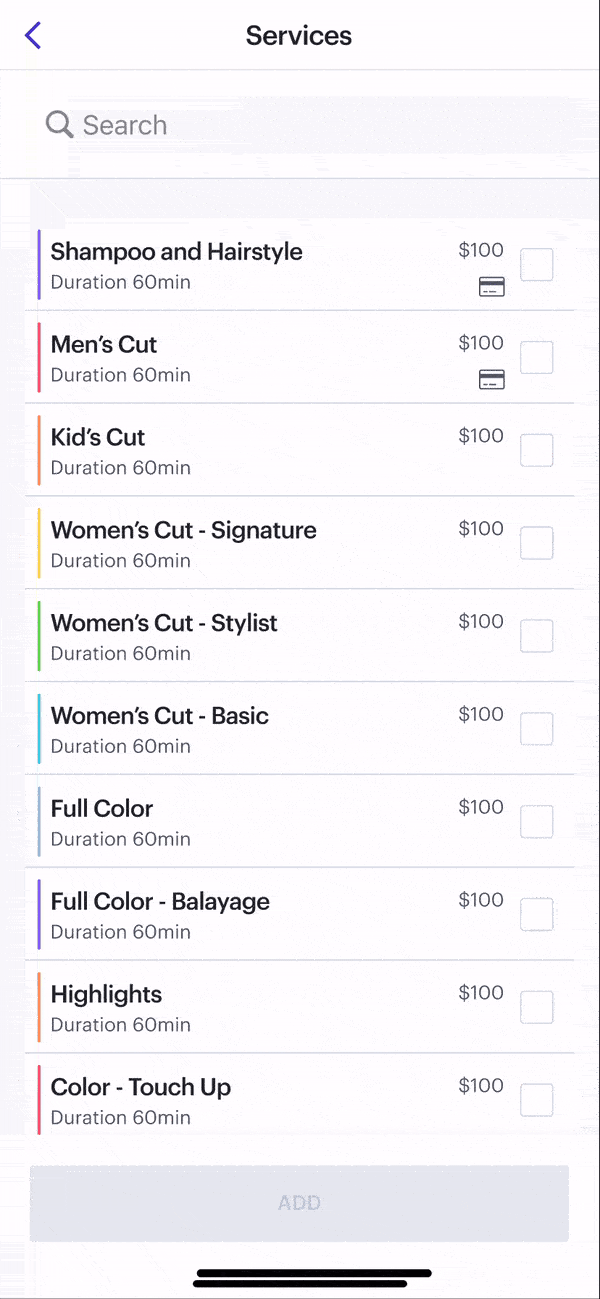
First high-fidelity prototype tested explicit feedback — critical to improving task success by 25%.
Refined Design
The final design delivered:
- Checkmark multi-select for explicit, predictable interactions
- Scroll preservation to eliminate “vanishing” selection errors
- Pinned services for constant visibility
- Accessibility compliance (tap targets, VoiceOver, non-color cues)
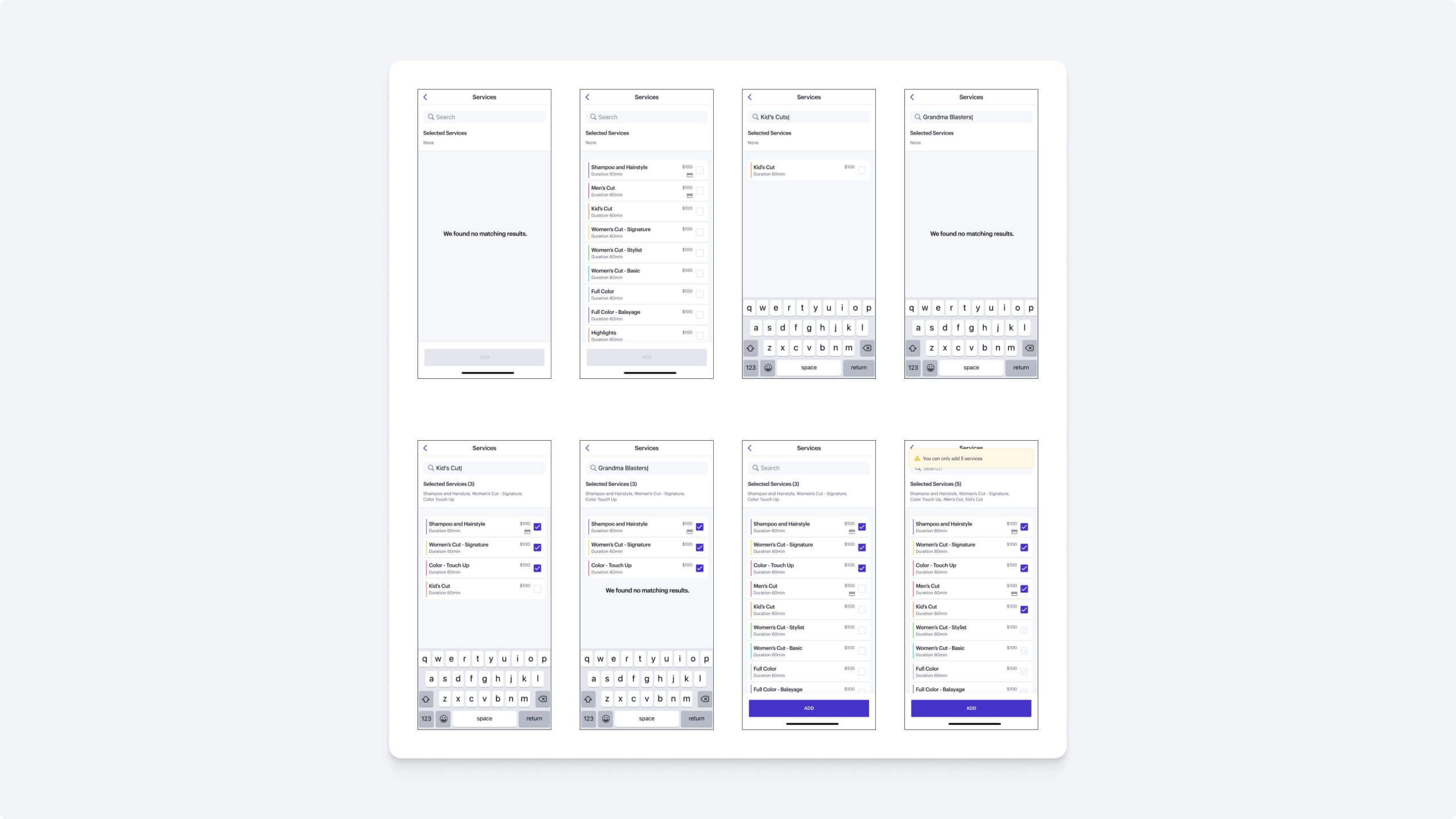
Refined mockups showing explicit selections, preserved context, and predictable confirmation — cutting CX tickets by 40%.
Usability Testing
I ran two rounds of testing (12 businesses + internal CX/QA validation) to measure clarity and efficiency:
- 83.3% task completion (baseline ~66.6%)
- 6.5/7 ease-of-use rating
- No confusion about add/remove/edit states
- CX confirmed pain points were resolved post-launch
Usability tasks validated that the redesign solved the right problems and improved confidence, efficiency, and trust.
Final prototype: scalable, efficient, and trustworthy interaction model that reduced CX burden and improved staff efficiency.
Impact
Business Outcomes
- 40% fewer CX tickets, reducing support costs and freeing CX capacity
- Lower maintenance costs from scalable, reusable pattern
- Improved staff efficiency directly protected business productivity
User Outcomes
- 25% improvement in task success
- Faster edits with fewer mistakes improved staff confidence
- Persistent, visible feedback reduced frustration and mistrust
Reflection
This project showed me that in high-frequency workflows, explicit feedback beats minimalism. By designing for clarity and predictability, we not only solved user pain points but also reduced costs and improved business KPIs. If I took it further, I would A/B test different feedback timing and expand parity across Android. Early alignment on trade-offs proved essential to delivering measurable results for both the business and its users.